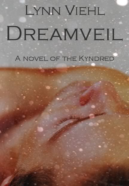
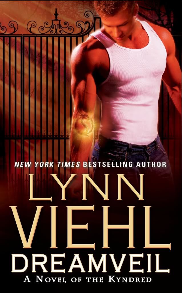
That most cover art usually fails to live up to a writer's hopes is not unusual or even unexpected; writers know publishers have other concerns that outweigh the artist's vision of the story. I don't think publishers can see the story the way writers do; they aren't invested in it the way we are. To illustrate this, here are two versions of the cover for Dreamveil: one mock-up that I made up myself to show what I felt was the perfect look/theme/style for the cover, and the cover the publisher chose to put on the novel:
Still, there are some publishers and writers who do seem to be on the same wavelength and do produce books with covers that do suit the story very well. I was thinking about this as I was pre-ordering some upcoming titles, and saw three I thought were excellent examples of cover art that fits:
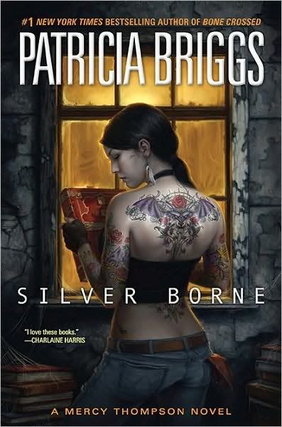
Silver Borne by Patricia Briggs
Although my favorite Mercy Thompson cover is still the gorgeous art they used for Bone Crossed, I liked the style of this one. The body art is highly detailed, and the setting composition is interesting and tells a bit of a story all on its own. I also chuckle every time over the perennial shop rag hanging out of her back pocket; my guy has the exact same rag on his work bench.
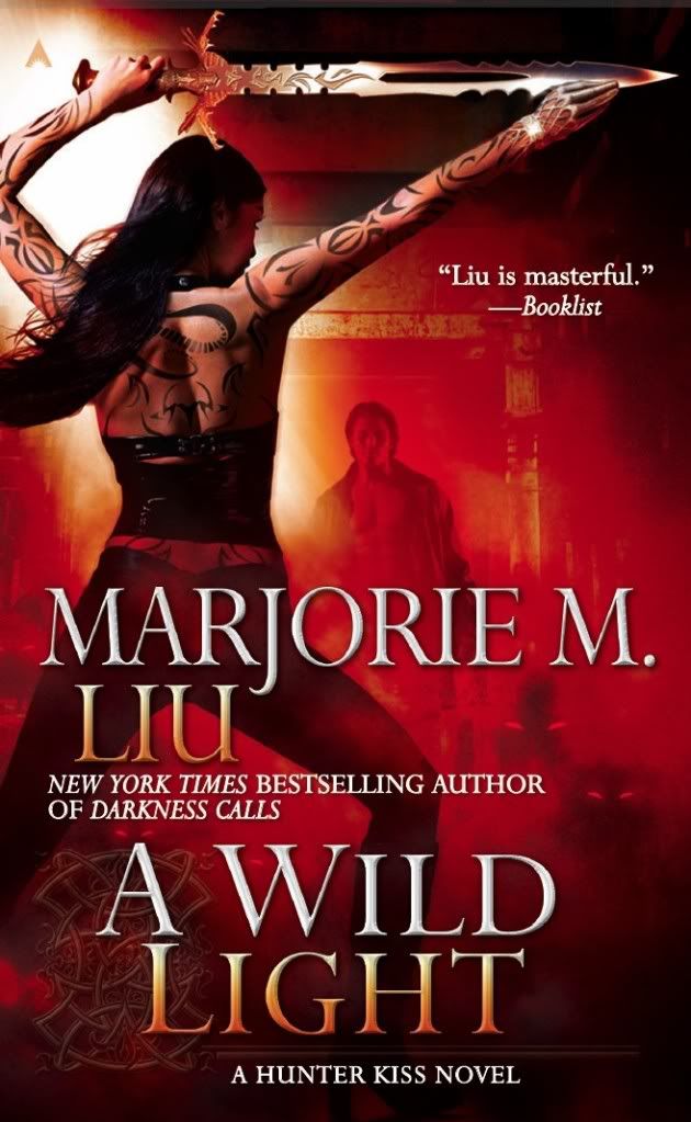
A Wild Light by Marjorie M. Liu
You can't see this cover yet on the bookseller sites but I nicked a copy from Marjorie's blog. It's a simply gorgeous cover, and I love that they continued the theme but added another character (presumably Graham) to the composition. Also, note the cuff ornament on the right hand; that's one of those tiny details that delights because it came straight from the story. Ace really does seem to get Marjorie as a writer, because all the Hunter Kiss covers have been seamless fits. An indy bookseller once told me that red is the hottest-selling cover color theme because it most often draws the eye of the casual browser. I don't know if that is true, but this one seems pretty riveting to me.
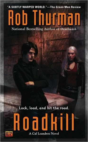
Roadkill by Rob Thurman
Not only great art, but a killer tag line, too. To demonstrate the power of a great cover, I actually started reading Rob Thurman because I spotted the exceptional art on the first Cal Leandros novel and thought, Hey, that looks cool. And was pleasantly shocked when the story delivered what the cover promised. Since then I think the Gods of Cover Art have showered Rob with a straight run of equally outstanding covers. When I talk about unique-to-the-author style (I can pick out a Rob Thurman novel from across a bookstore), thoughtful presentation and story-appropriate art, Rob's covers are the ones I most often use as shining examples.
Now it's your turn: what writer out there has cover art that you think best fits their
book(s)? Why does it work so well for you? Let us know in comments.

I like the covers on the Mercy Thompson books... except for all the tattoos, since Mercy only has a single pawprint tattoo on her stomach. Ack!
ReplyDeleteFor cover art that fits the book... hmm. Looking around at my TBR stack, I see quite a few examples, such as Mark del Franco's Connor Grey series, Jeannie Frost's Night Huntress series, Nalini Singh (both Angels and Psy-Changeling)... Come to think of it, I really liked the whole guys with eyes theme of the Darkyn novels!
Anyway. Cover art intrigues me, particularly the overuse of stock photographs. :)
Mmm. Will have to ponder and come back to answer that.
ReplyDeleteIt's funny. I can see that red would draw the eye - shiny red sports car speeding tickets, anyone? - but me, I tend to avoid them. I go for the dark ones.
And boy do I love me that tattoo. That book would come home with me just because of it.
word vereification = pauti
is that "potty" or "party"... depends on how your cover turns out?
Both Kelley Armstrong's and Rachel Vincent's seem to hit the nail on the head. Okay, the original Armstrong covers. I think the reissues have different covers. They work because when I'm reading the books, I *see* the cover--it becomes part of the story.
ReplyDeleteI'm very interested in this topic. I've always wondered what the process was and who made the decisions on the book covers.
ReplyDeleteI actually like your mock up for Dream Veil (the one on the left), It's possible that the flashy cover on the right with the hot guy doesn't say "dream" anything to me.
The one book that comes to mind when I think of a cover that doesn't match the storyline is Ransom by Julie Garwood. The cover shows a grand gated entrance to an estate, what does this have to do with a the Highlands? And in this case a strapping highlander on the cover would have led me to find this book.
Only recently did someone recommend it to me.
I do tire of the generic fantasy covers, though!
ReplyDeleteI'm fond of the black and white covers of Iain Banks
Well, other than the ones you picked, I really love Kim Harrison and Kelley Armstrong covers. They fit the stories and series personality very well, IMO.
ReplyDeleteMarie Brennan's Onyx Court books. They are GORGEOUS. Lush hues, intriguing depiction & details, and the stories are the same.
ReplyDeleteInteresting you really like the Thurman covers because of your three, that was the one that made me go 'meh, looks like any other urban fantasy.' I've been on a spate of them and three of the last four could practically swap books if they wanted.
The fourth, however, I love. Laura Anne Gilman's Retrievers series has great covers - the stories deal with electric current as magic and the covers are snappy and light-ish and I think work well. As a rule I tend to like Luna's cover art. They also did a great job for C. E. Murphy's Old Races.
My last book "George & Bob Stories: Life Lessons From Little Brothers" is a series of morality tales told through the eyes of two brothers (one is older than the other, but I forget which one.) When I received the cover, it was of two stick figures hugging each other while standing on top of the world. I hated it; to me they looked like aliens. The publisher said they wanted it to appeal to any demographic, so a black, hispanic or asian child would enjoy it as much as a caucasian. It has since grown on me, but only a little. I feel cheated.
ReplyDeleteMy first Loose Id cover (by Croco) had a delightful detail that became apparent only when I blew it up to poster size. The female, whose role was to be monster bait, was wearing a large, intricate pendant that turned out to be a fishing lure.
ReplyDeleteThe artist for Grimspace, Wanderlust, and Doubleblind had clearly read Anne Aguirre's stories. One thing that struck me about those covers was that they were better marketing lures than more technically accurate illustration might have been. Similarly, my most recent cover (by Anne Cain) is a rather better marketing tool than I'd have with an accurate depiction of a supersize male flanked by a slightly androgenous woman and a beautiful man.
I like your rain-spattered cover mockup, but I know I certainly could not come up with artwork that works anywhere near as well as what I get assigned.
Since I'm a huge YA fan, I will throw this out there.
ReplyDeleteThe original covers for Twilight were very good in my opinion. I like the stark simplicity of the black and white with touches of red.
I don't like it when the covers are too busy.
I agree about loving all of the Mercy Thompson novels but I will say the the tattoos are left up the the imagination in the book. In Moon Called Mercy says that she has the single paw print on her stomach but that she had other work done on her arms. (Can't remember if she said back as well.)
ReplyDeleteI also like the Black Dagger Brotherhood covers, I can spot one from a mile out. It was the cover for Lover Awakened that caught my eye and got me into the series.
The Darkyn books were pretty distinctive, too, I think. ; )
I like what you did with your cover, but I have to admit the guy on the New York cover has nice...arms. *g*
ReplyDeleteI'd say Patricia Briggs, Ilona Andrews, Jeaniene Frost, Melissa Marr, Kelley Armstrong, Kim Harrison, Karen Chance, Rachel Caine, Rob Thurman, Larissa Ione, S.L. Viehl, and Charlaine Harris all have really good branding of their books. I like some of the covers more than others, but you are never confused about who wrote them.
I recently read a short story collection of horror stories by David Nickle, Monstrous Affections. The stories were very X-file creepy in nature and I think the cover art depicted that perfectly. I'm having a helluva time trying to link to the amazon page, so here's the pic on my blog:
ReplyDeletehttp://vanessajaye.blogspot.com/2010/01/deliciously-disturbing.html
LOVED the cover for the urban fantasy novel, "Deadtown" by Nancy Holzner (here is the amazon link if you'd like a look yourself). Actually, I really think a lot of UF books get awesome covers.
ReplyDeleteI LOVE the covers of Megan Whalen Turner's Thief series (you can see them all on one page at her website).
ReplyDeleteI also found the covers of Catherine Asaro's fantasy series published by Luna to be very pretty. :)
I definitely like your mock up better---I like something left to the imagination, it makes me curious about the book, and I have been supremely lucky to have the Chris McGrath covers (get on my knees and thank the art god whenever a cover comes in and it's still being done by Chris. Never know when they might rip him away.) And I came up with the tag-line--go, me. :) Despite having a very good copy writer who's excellent at imitating my style when doing the back blurbs....Rob T.
ReplyDeleteI'm trying to decide if I should mention i've read Roadkill. But you have an awesome memory. No. I don't think I'll mention it. You'll get back at me for it somehow.
ReplyDeleteAn author whose covers fit their books? To me, one that stands out is Moning's Highlander series. Not the original covers, but the second run ones, each with a lone Highlander on the cover, no complete face or body, mostly in shadow, and each one fits the story. There's only one with a woman on the cover too, and though it fit with the story, the Hn in the book is the complete opposite of the one on the cover which would drive me crazy as the author.
ReplyDeleteI like the trade paperback covers of the Outlander books -- in fact, that style was adopted for the current hardcovers. I also like Jossilyn Jackson's book covers. The current books are stand alones, but I really think she has some of the most evocative covers. I also like the Thompson, Liu and Armstrong covers previously mentioned as well.
ReplyDeleteJulieB
AKK! I spelled Joshilyn Jackson's name correctly and then "fixed" it to _wrong._ *headsmack*
ReplyDeleteJulieB
Cormac McCarthy's covers always seem to fit. They're simple, but have a broad scope. I would find entirely too daunting a task to create a cover for one of his novels.
ReplyDeleteThe Lies of Locke Lamora by Scott Lynch. I bought the first one in paperback because of the cover. In fact, I've like both of the covers I've seen for the paperback versions of the Gentlemen Bastards series.
ReplyDeleteI also am fond of Jim Butcher's Dresden Files covers (the newer artwork versions.)
(Ashamed to admit it but I picked up Rob Thurman's first book because the cover was awesome. Now I've picked the rest of them up because I'm hooked on the story. Excellent stuff.)
There are so many good ones!
lol, word verification: foobled
I love, love, love Gail Carriger's Soulless cover. I remember when I first saw it, I just felt it was striking, so different from all of the other covers that surrounded it. The title font, the color composition, the detail in Alexia's dress and the parasol --- all drew the eye immediately.And the tagline ' A novel of werewolves, vampires and parasols' just totally solidified it for me.
ReplyDeleteThe recent Archangel's Kiss (Nalini Singh) had a really awesome cover -- it looked perfect for the book.
ReplyDeleteI've been known to, on occasion, pick up a book simply because Jody Lee did the cover. She did the covers for the Mercedes Lackey Valdemar series and they are all in tune with the books. And gorgeous of course.
I also agree totally with Patricia Briggs books (both the Mercy ones and the Alpha & Omega ones). I like how Mercy's tatoos change on the different covers to reflect what is going on in the books. Only the paw print remains the same. Like someone said earlier, the tatoos are left up to the imagination, and I think it is clear the artist is reflecting that by not keeping them the same since all the other details are perfect to the story.
The covers for the books in Megan Hart's "Order of Solace" series are stunning and voluptuous, featuring a partially nude, partially veiled woman, from the waist up, against a black background.
ReplyDeleteSkin and scarves - what's not to like?
There's not a tattoo in sight, which I must admit I find - dare I say it? - rather refreshing.
All mine have been mentioned. But I'll say, the one thing that bugs me the most about some cover art is when the characters on the cover are completely different from the description by the Author. I'm not a writer, but I would be terribly insulted that the "powers that be" don't care enough for their authors to respect that.
ReplyDelete