That most cover art usually fails to live up to a writer's hopes is not unusual or even unexpected; writers know publishers have other concerns that outweigh the artist's vision of the story. I don't think publishers can see the story the way writers do; they aren't invested in it the way we are. To illustrate this, here are two versions of the cover for Dreamveil: one mock-up that I made up myself to show what I felt was the perfect look/theme/style for the cover, and the cover the publisher chose to put on the novel:


Still, there are some publishers and writers who do seem to be on the same wavelength and do produce books with covers that do suit the story very well. I was thinking about this as I was pre-ordering some upcoming titles, and saw three I thought were excellent examples of cover art that fits:
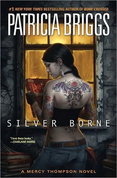
Silver Borne by Patricia Briggs
Although my favorite Mercy Thompson cover is still the gorgeous art they used for Bone Crossed, I liked the style of this one. The body art is highly detailed, and the setting composition is interesting and tells a bit of a story all on its own. I also chuckle every time over the perennial shop rag hanging out of her back pocket; my guy has the exact same rag on his work bench.
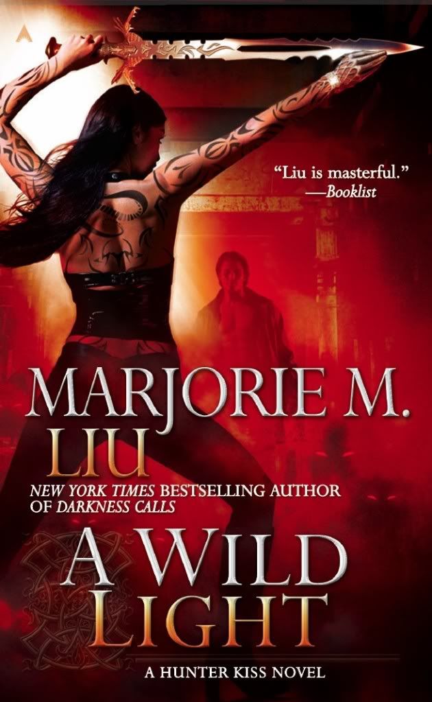
A Wild Light by Marjorie M. Liu
You can't see this cover yet on the bookseller sites but I nicked a copy from Marjorie's blog. It's a simply gorgeous cover, and I love that they continued the theme but added another character (presumably Graham) to the composition. Also, note the cuff ornament on the right hand; that's one of those tiny details that delights because it came straight from the story. Ace really does seem to get Marjorie as a writer, because all the Hunter Kiss covers have been seamless fits. An indy bookseller once told me that red is the hottest-selling cover color theme because it most often draws the eye of the casual browser. I don't know if that is true, but this one seems pretty riveting to me.

Roadkill by Rob Thurman
Not only great art, but a killer tag line, too. To demonstrate the power of a great cover, I actually started reading Rob Thurman because I spotted the exceptional art on the first Cal Leandros novel and thought, Hey, that looks cool. And was pleasantly shocked when the story delivered what the cover promised. Since then I think the Gods of Cover Art have showered Rob with a straight run of equally outstanding covers. When I talk about unique-to-the-author style (I can pick out a Rob Thurman novel from across a bookstore), thoughtful presentation and story-appropriate art, Rob's covers are the ones I most often use as shining examples.
Now it's your turn: what writer out there has cover art that you think best fits their
book(s)? Why does it work so well for you? Let us know in comments.


