Why white? Her favorite color palette is like the old joke: what's black and white and red all over? Everything the kid owns. Her linens are scarlet and snow white, her room accents are onyx and everything else echoes that stark trio, even her vaguely Asian/Gothpunk wardrobe.
 We're not sure where this comes from, as her father likes browns and neutrals, and I'm more into sea and sky colors for living spaces, but we're going along with it. We like to let the kids express themselves as much as possible in their personal spaces, even when we don't find their choices especially appealing. To me her palette resembles the inside of a diner from the fifties (or a Steak & Shake now), and all that red makes the medic in me nervous. Still, I look at it this way: I don't have to live in it. And whenever my guy starts shaking his head I remind him she could have decided on something more exciting for her walls, like traffic accident crimson, or moonless midnight sky.
I began deliberately using color palettes for stories back when I began writing the Darkyn books. Paletting was something I did all the time as a quilter, and I wanted to see how it would work with story. At first I centered on one color for thematic purposes, but as I studied nature, art and architecture for world-building purposes my story palettes began to grow and become more complex. In the visuals section of my novel notebooks I started adding pages of color swatches, first from my own fabric stash and then from raids on magazines, photos I'd taken and chips cut from paint charts.
It seemed inevitable that I would end up creating specific palettes for my characters, too. Jayr's palette (bronze, tangerine and deep amethyst) was one of my favorites, as was Byrne's (indigo, garnet and steel.) I used them in normal details, like wardrobe choices and room decor, but also in physical attributes like Byrne's facial tattoos and how Jayr's hair looks in firelight.
 For one of the novels I'm working on now I wanted to use some of the colors of Provence: dusty lavenders, autumn oranges, old ambers, slate blues. My guy had already brought home a stack of paint chip charts from the home improvement store for my daughter to look through (in case she changed her mind about the white), so I went to sort through them and see if I could find some chips that matched the palette in my head. Among them I found this lovely little pamphlet from Olympic Paint's Audubon Collection titled "Brilliance" which featured eight colors that would look completely at home in Provence (and no icky yellow, which surely had to be a sign.)
 Already details from the story in my head are rearranging themselves around the palette; the colors of a particular sunset, a slinky dress, the walls of an old church, a bricked path. Now I can clearly see the exact colors of my female protagonist's eyes, the carved stone cross she wears and the overalls she puts on when she works in the garden. The story palette is placing certain gems in the hilt of my male protagonist's sword, sifting light through his hair and shading the hide of a horse he rides. When in doubt, all I need do is glance at this palette and let it guide my choices.
 Don't limit yourself to fabrics and paint chips for the story palettes you create. You can use photographs, scrapbooking papers, found objects -- if you can print, paint, sketch or glue it on paper, it will work. If you find an image online with colors that you'd like to use in a story palette, feed the URL to DeGraeve.com's Color Palette Generator. Along with html codes it will give you two rows of color swatches which you can print out and use for a palette page.
For those of you who enjoy crafting and/or making art, take the colors from your story palette and create a project with them: a painting of a character or setting, a themed scrapbook or even a digital mock-up of your dream cover art. I've used story palettes to make several quilts, and working with the colors even in something unrelated to my writing helps deepen and broaden my understanding of them. Every color provokes a range of feelings, and spending time with that away from the story can lead to new discoveries that will go right back into the work.
There are all kinds of rules involved in palette-making, and I think you should break each and every one of them. Color, like any other inspiration, is quite personal, and should not be dictated to you by the Thought Police. If you love dark chartreuse paired with electric hot pink and baby blue, go for it. To me the strongest -- and most memorable -- palettes are always the rule-breakers.


 Faceoffbook: A site on which you are not permitted to post any images of yourself or your body parts, which includes any/all Glamor Shots, sex act partials, meaningful personal symbols, short animations from porn movies or Seinfield episodes, pictoral-enhanced famous quotations, celebrities you secretly believe you resemble, participation in drunken revelries or anything that may be introduced as evidence against you in or out of a court of law. If you've used it as an avatar, you won't use it here.
 Muter.com: For people who don't own mobile phones, hate texting and/or prefer to hold all of their conversations in private without an audience. Welcome! Now, shut up.
 Unromantic Times.net: The premiere site for the unattached, happily single and not planning on getting involved with anyone ever ever ever. Members may freely communicate without fear of being matched on any level, having to meet, make committments or film a commercial that requires them to fake how happy they are together. Their motto: what's love got to do with it? Uh, nothing.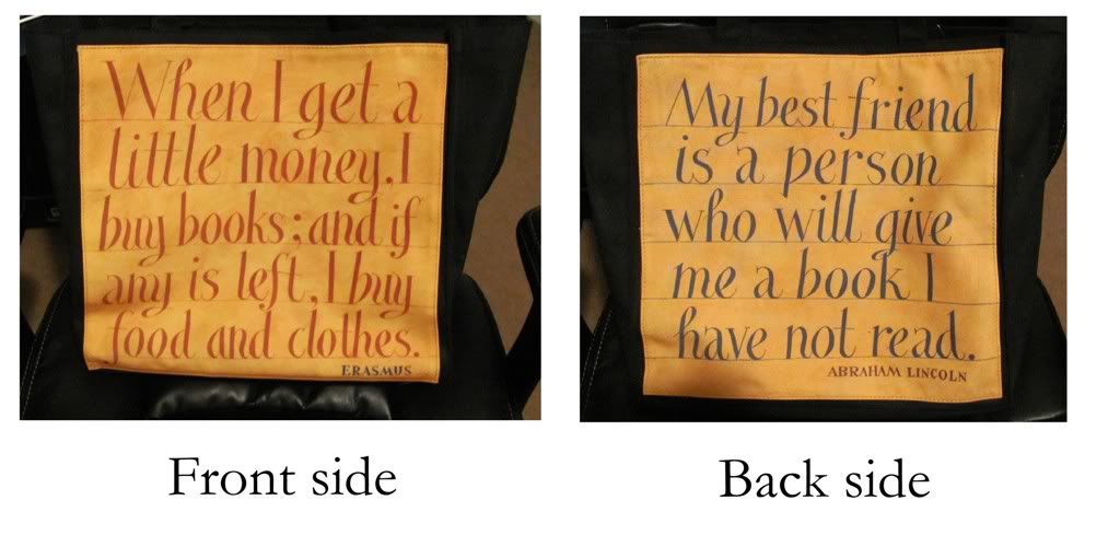
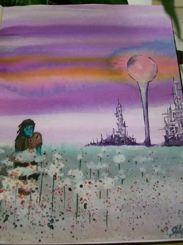 Visualization of a concept is an important part of writing for me. If I can see a scene in my head, I can write it, and my imagination is already pretty well-stocked with faces, places and things. Painting, sketching and photo-shopping also help when I have an idea I want to turn into a visual reference, particularly with settings and characters (as was the case with creating this watercolor from a StarDoc novel scene for a long letter I sent a friend.) Creating art is a great way to get to know the story element you're depicting and serves as a jog for little details that might otherwise slip your mind while you're at the keyboard.
 Style is all about the forest, not the trees, of imagery. One thing I really enjoyed about all the Underworld movies was the intricacy and consistency of the dark, bleak dystopian world of the vampires and the Lycan. Here's a still of Selene, the protagonist from the first two Underworld movies, and even something as simple as the marble balcony has that blackened, neglected look to it. Battlestar Galactica (the new series) was another show that offered incredible styling which suited the storyline and bucked the traditional bright-and-shiny Utopian soft-serve SF television shows generally deliver. Battlestar was gritty, realistic and very, very human, especially with the cast choices.
  Create a visualization journal for your project. Divide it into sections for different story elements: characters, settings, time period, theme and detailing are all good, but tailor it to what you want to explore visually. Then start filling it up with images that illustrate in any manner that particular element -- body models, architecture, paintings, sketches, found objects, fabrics or anything that relates directly to and/or enhances your vision. If there are keywords or notes you want to add, write them as captions to the images. Before you begin writing a scene, go through your journal and refresh your imagination as to the specific look you want.
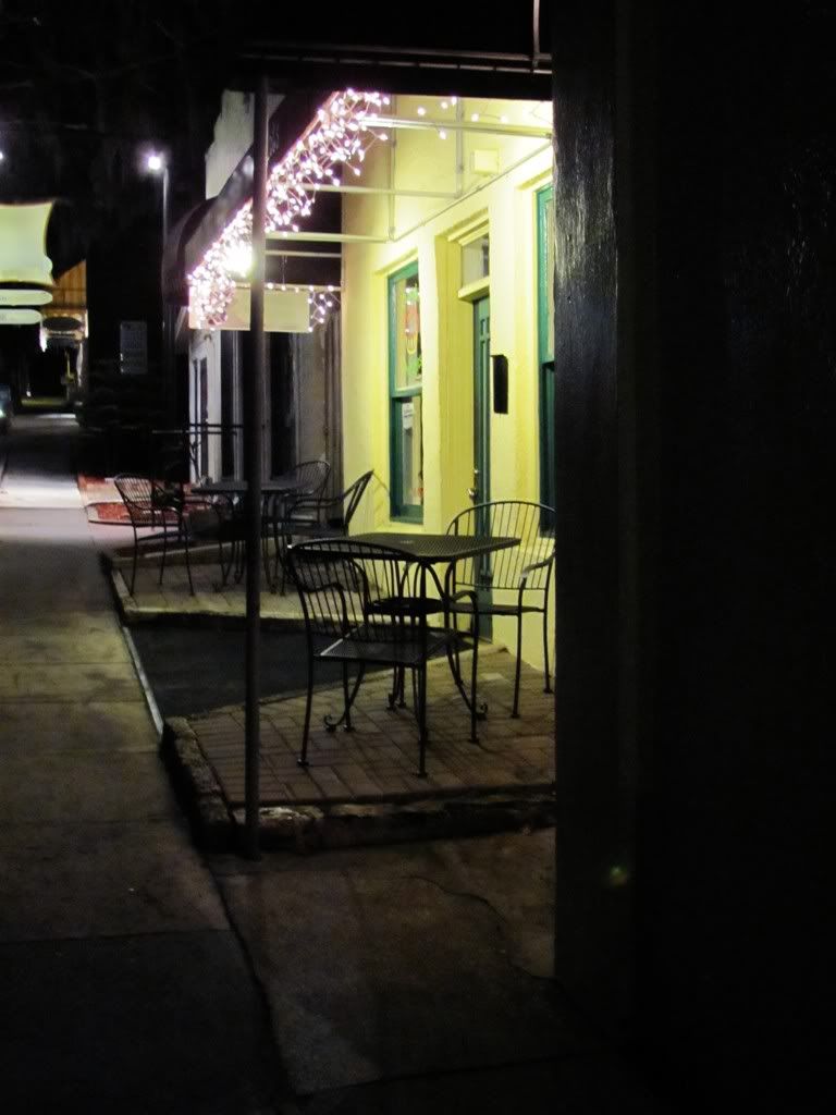 Take one location from your story and try to find one that is similar to it in your area. Pay a visit with a camera and notebook, and take some snapshots of details that you can use in your story. Write down notes on things you see that you didn't think of, and pay special attention to things like light, sounds, smells, textures as well as how being in that place makes you feel. This is a shot I took one night recently while getting some visuals on what a small country town feels like after the shops close and everyone has gone home for the night. Feels a little spooky, especially when dozens of bats began pouring out of one restaurant's chimney -- one place I don't think I will be in a hurry to make reservations at anytime soon.
 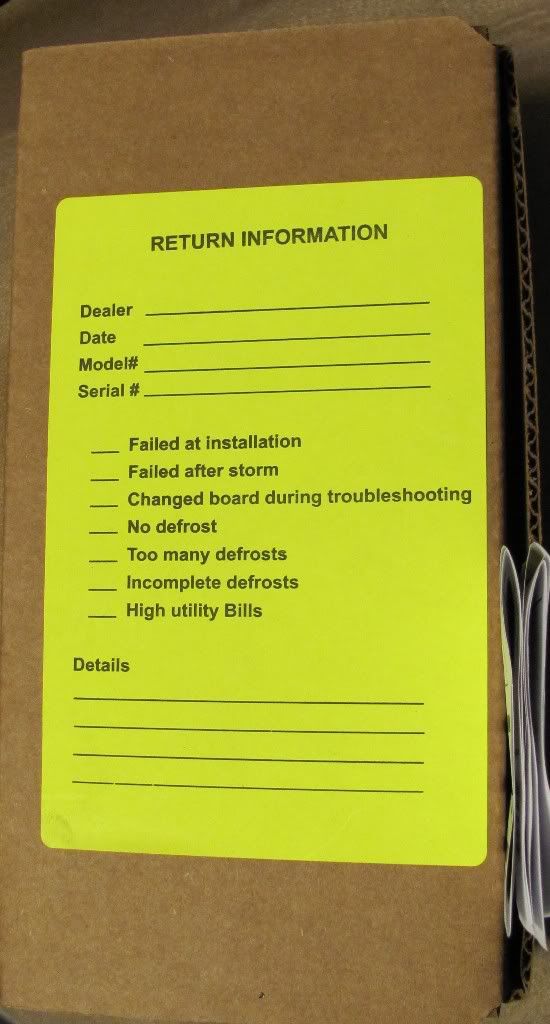 My guy has a little control board sitting in a box on his work bench. Not an unusual thing; on the equipment he works on these boards are pretty common now. When one burns up or fails, he has to swap them out. It must be under warranty, too, because the board's box has a big yellow Return Information label on the top.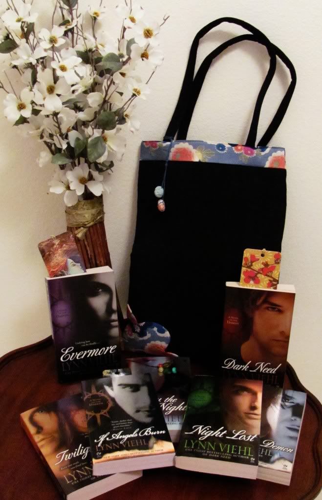
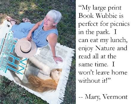
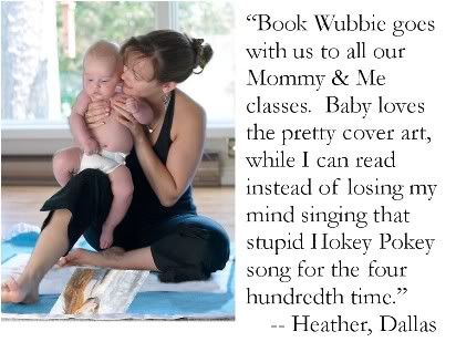
 Have you ever wanted to read a novel while wrapped up in the warmth of a cuddly soft blanket? Frustrated with all those cheap fleece throws that only offer ugly wide sleeves and those silly, embarrassing patterns?
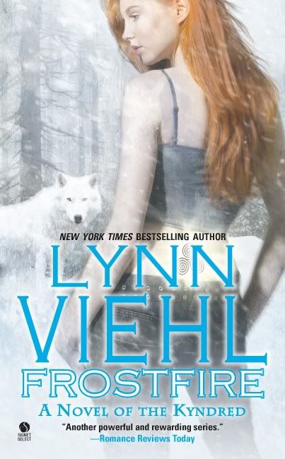 Today I heard from my agent, and the NYT mass market bestseller list for January 23, 2011 will show Frostfire coming in at #32 on the extended list. There was much tough competition from huge names, and many rollover titles, and since the list was calculated only four days after my release date probably only about half of my first week sales counted toward it. For all those reasons #32 is a genuinely awesome showing.
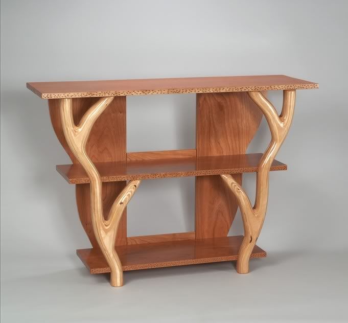 Another, smaller design offered on their site is this three-shelf unit that includes two front braces either carved from or carved to resemble tree branches. I liked this shelving unit because it is more suitable for limited space (the room we'll be making over is the smallest bedroom in the house.) The open sides and curving front braces also help it avoid that refrigerator-box feel; it made me think of the great treehouse from Swiss Family Robinson. I'm not particularly in love with the appearance of the wood they used for the backing and shelves, though, because it looks a lot like the cheap plastic veneer-particle board stuff they use for bookcases you can buy for thirty bucks from Wal-Mart. I think a darker wood would have contrasted better with the prettier front branch-shaped braces.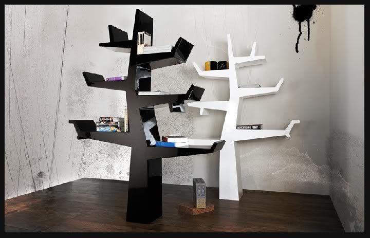

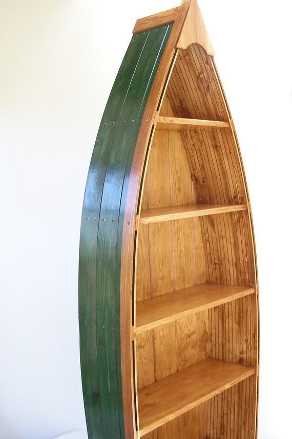 Since my guy and I grew up by the sea, when I found
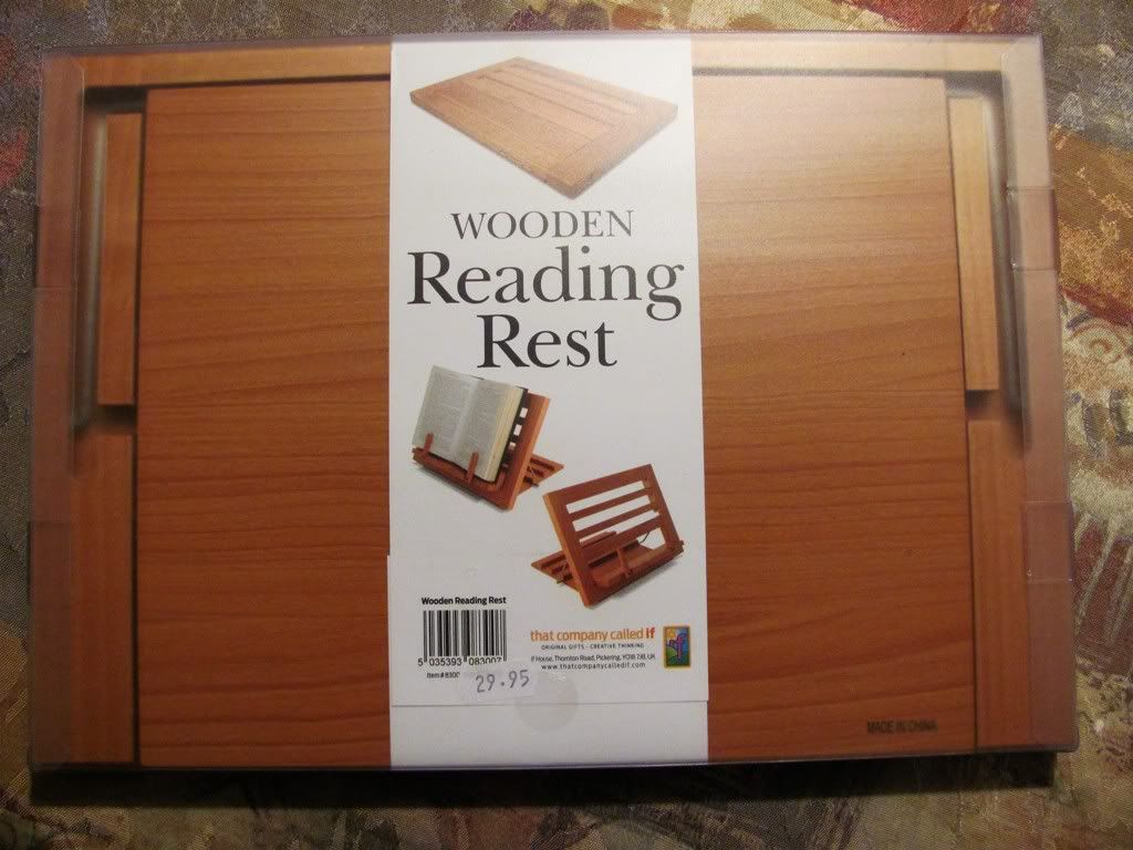 This
This 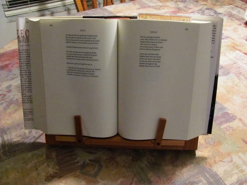 The main problem I had with this one is the page space allowance in the width of the holder; the page holder pegs are screwed in place and not adjustable, so they can't be used if you're looking in the back pages of a very thick book. I'm going to write to the company and suggest they put the pegs on sliders so they can be adjusted out as well as up and down. Also, while it appears to be well made, I thought the price at $29.95 was a bit high. For what you get, I felt $10.00 - $15.00 would be more reasonable. Maybe they should make it out of something less expensive than Canadian Alder wood.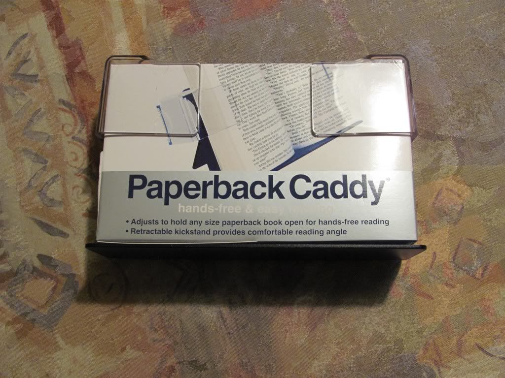
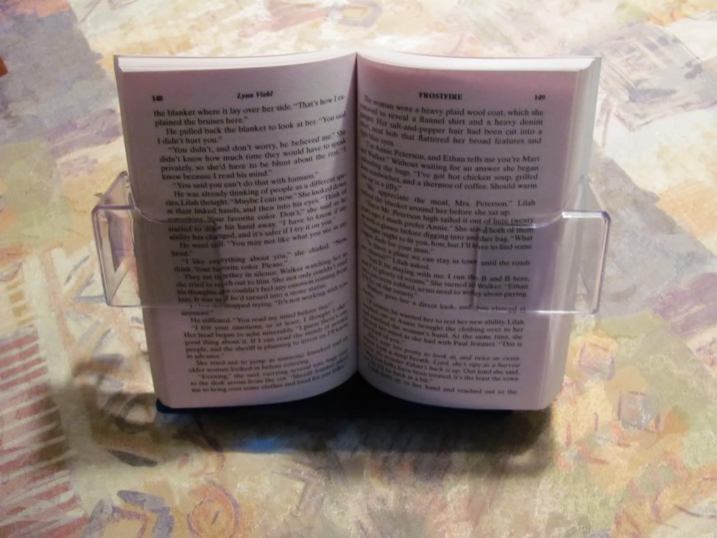 The company claims on the packaging that the Paperback Caddy is "Designed for one-touch page turning." If that's true whoever designed it screwed up, then, because I had to use both hands. Getting the page I was turning tucked under the arm was difficult enough to make me almost wrinkle the page in the process. Just to be sure it wasn't being caused by me and my lack of dexterity, I had a fully-abled friend try it, and she had the same difficulty. I also felt this one was overpriced at $12.95, considering how troublesome turning the pages were, as well as the quality of the plastic (the arms are pretty sturdy, but the back component is thin and cheap, and I'm not sure how long that kickstand is going to last.)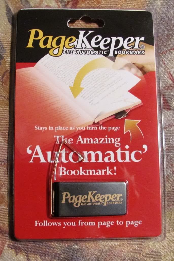
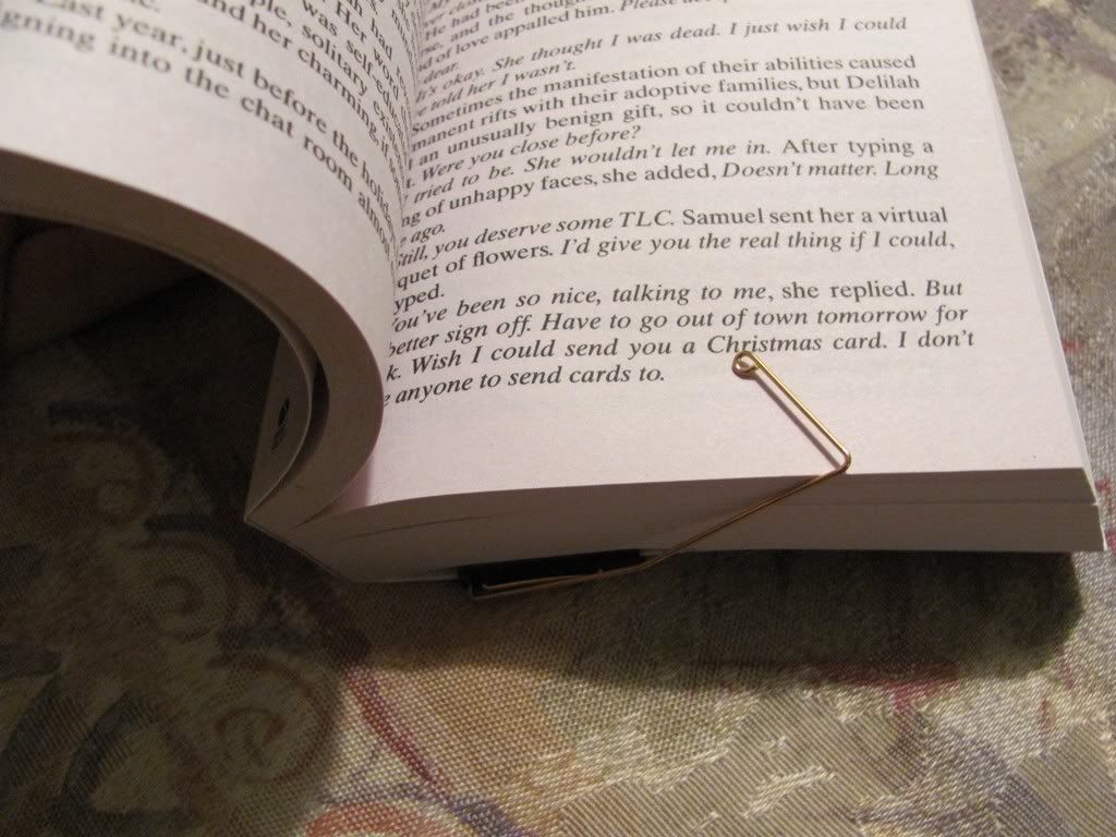 I think the main drawback to this gadget is its limitations. It's designed to be a bookmark, not a book holder, so it won't keep the book open for you or do anything about the pages you've already read. Also it doesn't work on marking the front pages of huge thick books; the bent paperclip part doesn't stretch that far. I also wonder how long the snugness of the back cover clip will last with constant use. But if you're one of those readers that for whatever reason endures paper bookmarks constantly falling out of your books, then this is one possible solution to your problem.
 Last year
  The first project of 2011 my guy and I had planned is to renovate one of our bathrooms, and that morning we went to local home improvement store to pick up some things we needed. On the way to the check-out we passed a magazine rack with all the usual how-to gardening, painting and other home stuff, when I spotted the Dec/Jan issue of Fine Cooking. Generally I don't see many cooking mags in home improvement stores, so that struck me as odd. So did the gorgeous towering dessert featured on the cover, which was one I'd never tried to make (and mentioned that here on the blog.) The message couldn't have been plainer if they'd printed it on the cover: #2 -- Don't be afraid to try things you think you can't do.