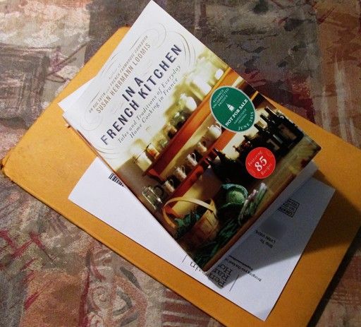
Honestly, it's like Christmas without the decorating, and I can now say with certainty that yes, you actually can get cool free books from LT's Early Reviewers. To keep my end of the bargain once I've read it I'll post an official review here, at LT and a couple other places.
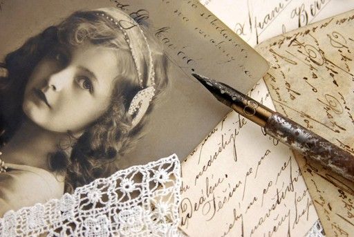
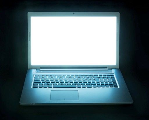
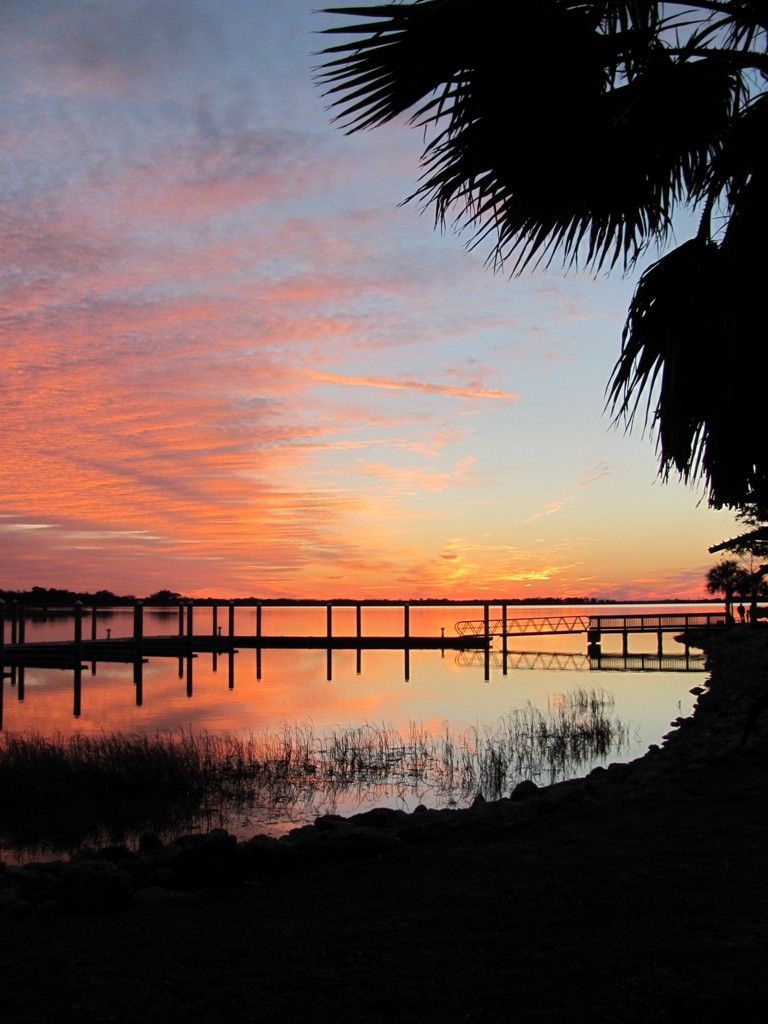
I'm also tinkering on cover art for Ghost Writer, my current Just Write Thursday story, and have narrowed a bunch of possibilities for the image down to these four (which will all need some tinkering, titles, bylines, etc.):

Which do you like best? Let me know in comments.
Added: As I mentioned in comments I could also combine a couple of these images, like so:
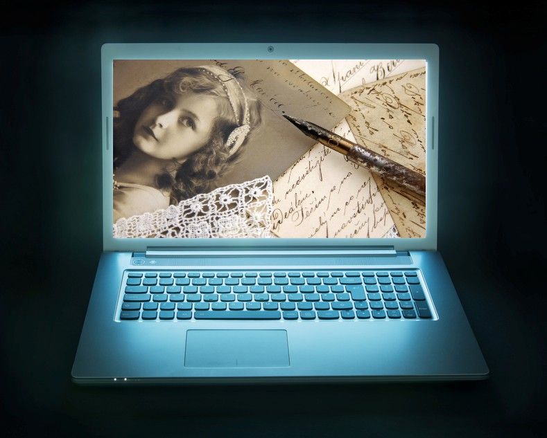
Image Credits:
Vintage writing: Miiisha
Laptop screen: pogonici
Writing hand: Syda_Productions
Lake Sunset: Yours Truly

Vintage writing is my favorite
ReplyDeleteThanks, Judy -- that one appealed to me a lot, although I was worried it was a bit too vintage for a contemporary story.
DeleteI like #1 best, but #2 is pretty cool.
ReplyDelete#1 suggests ghostly spirits *and* ghost writing in its various meanings.
#2 implies a modern ghost writer.
#3 is just ???.
#4 is gorgeous, but off the top I can't emotionally apply it to ghost writing.
I'm thinking the same with #2. I even thought about combining my two favorites by placing the vintage writing image #1 on the screen of the laptop image #2.
DeleteI like #1 for the mystery feel, but #4 works for beautiful locale with maybe just a touch of eerie lurking in the coming darkness...
ReplyDeleteThanks, T. #4 is the real-world inspiration for the story setting, btw.
DeleteI like Number 1 best. I like the combination of #1 with the laptop also. #3 is my second choice though.
ReplyDelete#4 makes me yearn for home. Even though my actual birthplace is nothing like that, I spend years travelling to such places and it just feels… mmm. I could live there happily forever.
ReplyDelete#1 is my favourite for the book cover, especially the way you've mixed it with #2.
I've had this tab open since yesterday pondering each idea. I love #1, but it does invoke vintage. # 2 looks better as you've posted in #5 than it does with the blank screen, but I also love #4. Too bad you can't do something eerie as someone else said, a ghostly figure, fog, something that would indicate the paranormal aspect of the book. Or maybe #2 with a ghostly face looking back? Did you ever watch What Lies Beneath? At the very end, when she's leaving the cemetery, if you blink, you'll miss the ghostly face in the snow. It's really well done. Something like that would be good...but that's just me. I just love the story so far. I don't care if you put it in a brown paper bag! ;)
ReplyDeleteI really like the last one, the combined image. It's exactly the type of image that I conjure when thinking of your story because of the juxtaposition of the past on the present.
ReplyDelete