 I get some of my best story ideas at the local home improvement store, where I always make a point to stop by the paint department. Paint manufacturers have some of the most creative marketing people of any industry, and they're always finding new ways to not only name colors but also combine them into palettes that reflect a certain trend or mood.
On this trip I was simply looking for color inspiration for a character who so far has been resisting my efforts to properly visualize her. Sometimes putting together a personality-type palette helps me make that jump from knowing the character to actually seeing the character in my head. We didn't have a lot of time for me to stand and stare paint chips, though, so I collect some of the idea folders and brought them home to brood over.
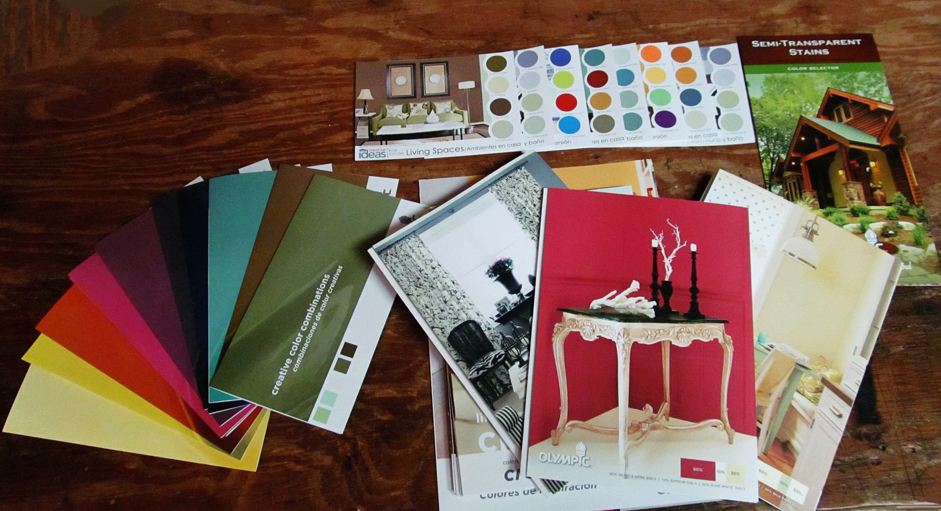
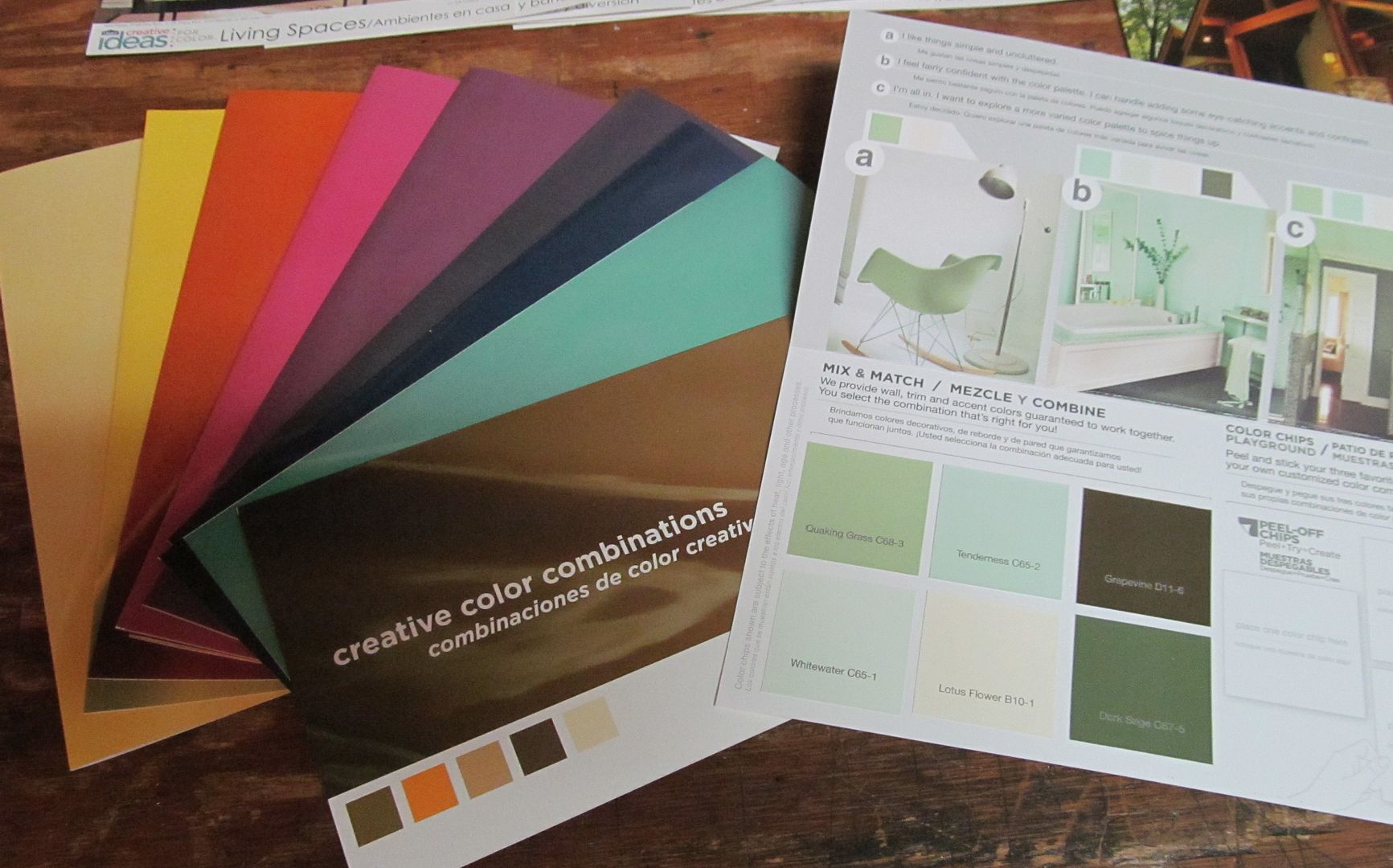
 Olympic paint has recently done some marvelous things with their color line: they've created little color palettes with removable, stick-on chips you can transfer from the idea folder to something else. I've always cut out the chips and clipped, stapled or glue-sticked them into my novel notebooks, so this was super convenient for me. It also allowed me to mix colors from several different collections into my own custom palette. Valspar's latest idea cards show a four-color palette next to a room where they've been used, which can be very helpful when you're trying to create a setting. If you're not crazy about recombining colors, these cards can give you some ready-made palettes to use for characters, too.
Olympic also has folders with design and decorating ideas to reflect a certain lifestyle (creative, easy, global, serene and techno are some examples.) These folders contain eight-color palettes (with more of the removable, sticky-backed paint chips), rooms in which the palettes were used, as well as textures and ideas that make them work. These are worth picking up just to see some of the amazing rooms they put together.
I also found a new resource on this trip that is going to be extremely helpful to me personally; a folder of paint chips showing Olympic's line of semi-transparent wood stains. For some reason describing variations on the color brown are especially challenging for me, and after writing fifty books I feel sometimes that I've used up every creative word that means brown. In this one folder there are 48 chips for different shades of brown, and while some of the shade names are not new to me (russet, mushroom, black oak), others (weathered barnboard, clove, driftwood) are. Seeing all of them together gave me the push I needed to think about the color brown differently.
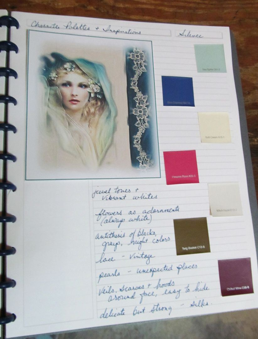
 Anyway, back to my image-resistant character. Once I was home and could play with the paint chips, I built a palette for the character that simply felt right -- two shades of blue, two shades of warm whites, a vibrant rose, a dark violet and a cool brown. I then kept that palette in my head and went through my character idea folder with all the body- and face-model images I've been collecting as possibilities for this character, and there she was -- an image I almost didn't put in the folder because it's almost the exact opposite of what I assumed the character would look like.
This character is dark, troubled and very conflicted inside, but building the palette helped me see her from the outside, where it doesn't show. I already knew everything about her is kept hidden and silent, but I didn't think about how that could be expressed (and camouflaged) by her appearance. She looks like a creature of light and mystery; delicate, vulnerable and even a little helpless -- which she certainly is not on the inside. This character's palette doesn't reflect who she is, but rather who she wants to be. That was something I needed to learn before I could see her properly.
Using color palettes to build characters forces you to rely on your writer instincts, and allows things that may be lingering in your subconscious emerge. That's the most valuable aspect of playing with colors; they connect to us on different levels and inspire us to take new directions. They can also help us discover things we know but we haven't yet put together into a cohesive construct. So the next time you have to pick up something for home improvement, stop by the paint department and see what stirs your imagination for story improvement.

Great idea, I'll try the paint store soon. I've been doing this with fabric swatches, which gives me texture as well as color.
ReplyDelete- KrisW
Fabric swatches are great for that; I use those in my quilting diaries. Hmmm, must get out some silk swatches for the next Toriana novel . . . .
DeleteFascinating, just totally fascinating.
ReplyDeleteFun, too. I just have to be careful or I'm going to end up repainting my entire house. :)
DeleteI can't go into my local home improvement store without looking at the paint palettes, and not just for the colors, but for the names. I've been inspired by many a paint color name.
ReplyDeleteI wonder who they are, those folks who match color to description. I hope the names aren't randomly generated by computer...how disappointing--and unromantic--that would be!
Finding original, different but instantly understandable color names -- especially colors that can translate into descriptions of hair, eyes, skin or garments -- is like an endless writer quest, I think.
DeleteI would love to meet someone who names paint colors for a living. Imagine the stories they must have -- and the fun at work!
I'm world-building at the moment and I can see how this could help. Great suggestion!
ReplyDeleteI'm so happy with how this paint chip palette experiment came out I think I'm going to try it for another, hard-to-envision character, Darlene.
DeleteI have a small drawer with lots of samples in it, including counter top and wall treatments, textured metals etc. I haven't played with them in a long time, but your post makes me want to go DO something with them. :-}
ReplyDeleteI also have some old tarot cards and illustrations from antique books somewhere about.
Fun!
I love Tarot cards, Diana; I got a set with some gorgeous illustrations just for the images.
DeleteWhen I was a kid my mom would sometimes bring home from work outdated formica sample cards. After admiring them for awhile would make them into tables and chairs for my sister's Barbies. :)
Wow, I love this idea! And I love the depth it adds to your character.
ReplyDeleteIt surprised me how quickly it revealed her to me, Deb. I was really just fooling around with the paint chips when I got the idea to put together a spontaneous palette for her. But sometimes the best tools work that way -- intuitively.
DeleteI love posts like these. Thank you.
ReplyDeleteGlad you enjoyed it, lxz. :)
DeleteAs a kid, I loved picking out paint chips. I've got to try it again, now that there's something I can actually do with them.
ReplyDeleteThe sticky ones are really cool. I'm also using the chips in my color journal to flesh out some of my shade ranges (so that when I need to describe a dark turquoise I have more than Malibu Barbie's Beach Blanket as inspiration.)
DeleteI went to Lowe's last night and picked up all the Olympic booklets so I could try this. I'm not sure how I'll do, since I'm not very visual as a writer, but I really want to kickstart my new project into something that I can finish. So, what the hey -- I'll give each character some colors and see if that jars something loose in my brain.
ReplyDeleteIt's worth a shot, anderyn, and if it doesn't work no worries; you may get an idea that will lead you to a resource that does mesh with your process.
Delete