 Tonight I went to Wal-Mart with my guy to pick up some light bulbs (to reduce our energy consumption, we've decided to switch over to those low-watt twisty ones that seem to last forever.) While he was looking at the different brands and figuring out which was the better buy, I drifted over to the paint aisle to pick up some chips for a setting palette I'm trying to rework.
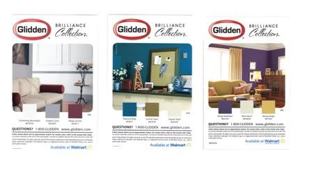
 Wal-Mart sells Glidden paint and keeps a nice, simple display of single-color cards showing the different shades you can buy or have mixed up. Scattered among these were also some very cool color idea cards. These cards, which are illustrated with gorgeous photographs of landscapes, flowers, fruits and even this adorable kitten here, have example pics of finished rooms and decor items along with info printed on the reverse side. They cover everything from how to use a color, how to combine it with other shades, the effect it has on people, what it means if you really like it, etc. etc.
On the back of the solid color paint chip cards (which Glidden made the same size as their color idea cards) the manufacturer put a photo of an attractive room painted in the same color with two accent colors, and listed all three with a small square swatch of the color, the shade name and stock number:

This is one of those little brilliant ideas someone thought up for people who want to use more than one color but aren't sure what to pick, how to coordinate them, or what they'll look like together.
I love cards of all types, so I picked up a bunch of the idea cards along with the specific color cards I wanted (here's a pic of the full spread.) Glidden's cards are small enough to tuck in the pocket of a binder but large enough to give you a decent feel for the color or color theme. I also like them being loose so I can shuffle them around and put them in different combinations to design my own palettes. Someone mentioned photo brag books in comments to another post, and I thought those would also make a perfect holder for these cards.
Here are two more of Glidden's color idea cards:

Glidden has also inspired me to start making some of my own color idea cards, too. I can use photographs I've taken or interesting color-themed images I find in magazines, catalogs or online, and customize them with notes on the back of how I want to use them, different synonyms and metaphors for a particular color or theme and so forth. I know it can't hurt, especially when I'm wrestling with imagery or description in the story.

That's a neat idea :).
ReplyDeleteUmm, just a caution on the fluorescent bulbs... Some people have vision issues related to processing that light. I didn't know I did until my hubby redid the house in them and suddenly I couldn't read for longer than 10 minutes or so because the letters began to crawl across the page. It's called Irlen Syndrome. I'd had it my whole life and just coped, but the bulb change made it too strong.
I read the book I won from you :D It was great!
ReplyDeleteI bet when Glidden made those cards, they never imagined that writers would use them for inspiration. I wonder what response you would get if you wrote to the Glidden marketing department and told them how useful their idea cards were.
ReplyDeleteCFC lightbulbs are getting better all the time. Some are less harsh than others and some even mimic daylight pretty well. Glad to hear your guy took his time and chose wisely.
I too have had some trouble with the less expensive twisty bulbs so take care.
ReplyDeleteThe color cards are wonderful things. I've used them a few times when trying to chose a room pallet. What I also like is the other cards in the same row are usually complimentary enough that if I do any kind of textured/artistic/faux finishes, I'm not stuck with just two or three colors.
You teach me something new almost all the time though. I'd have never thought of using the things for my novel settings!
Kitty! (Yeah, I'm easily distracted.)
ReplyDeleteI love looking at those paint card things and imagining who lives there. I'm such a dork.
Hello Margaret!
ReplyDeleteI work for Glidden's marketing department and I bet we would say “you’re right and thank you”! We didn't think that we would be inspiring writers, but we did hope to inspire people about to paint. Color selection should be easier and that was our inspiration for doing the cards like that. Good luck with the writing and thanks for positive feedback!