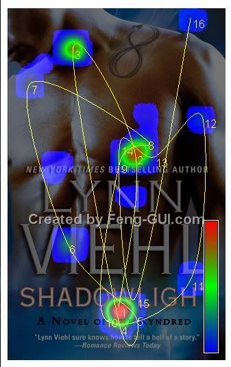
"Feng-GUI simulates human vision during the first 5 seconds of exposure to visuals, and creates heatmaps based on an algorithm that predicts what a real human would be most likely to look at. This offers designers, advertisers and creatives, a Pre-testing technology that predicts performance of an image, by analyzing levels of attention, brand effectiveness and placement, as well as breaking down the Flow of Attention."
To test drive the service, I uploaded my latest cover art into the online generator (which you can use for free, but only once every five hours, btw. Also, they seem to save a copy of whatever you upload, at least temporarily, so I wouldn't upload anything you don't want the world to see.)
Here's the heatmap I got in return:

According to the site, the heatmap information should be interpreted as follows:
"Heatmap color - The more intense the color (from blue to red), the more interest the viewer is. * Hotspots - Fixations - Regions of interest. The circles represent the focal points and their size.
Hotspots Order - The number next to the circle, represent the order in which the eyes move.
Gaze Saccades - The lines represent the movements of the eyes between hotspots.
Which areas are being ignored. If there is no color or circle in an area, that section has no interest."
I'm glad to know that my title and byline were the first thing the simulator looked at; that's a little reassuring. Not that I mind it then looking at the nice young man on the cover; kind of difficult to ignore him.
I don't know how accurate the results are, but this might be an interesting generator to try if you're putting together your own cover art or web page design and want to see what it thinks your hottest spots are.

I doubt his tattoo is completely ignored. It's my favorite part. ;-)
ReplyDeleteThis looks fun.
ReplyDeleteThursday Thirteen - Me & Music
I'm glad people were looking at the title and byline. However, it seemed to me that if the cover model turned his hips a bit, the #1 dot would be right over his crotch! Could readers be trying to see just how much skin is exposed, here? (Nahhhh.)
ReplyDeleteIs it possible the main focus spots are on the title and byline because the text is there? After all, it's quite natural I think for human eyes to be drawn first to the text (larger text, followed by smaller text), before moving elsewhere.
ReplyDeleteAlthough I'll admit I looked at his chest first XD.
All the same, it's a fascinating concept.
I'm surprised there's no spot on the tattoo. I've been staring at the tattoo.
ReplyDeleteI'm with Janicu... the tat was the first thing to catch my eye. But then I knew it was your book, Lynn and I know how good you are, so I didn't need to look those places, As for looking further down... didn't everybody? :-)
ReplyDeleteYeah, like everyone else, I think there should have been a hotspot on the tattoo. It's there for a reason, I'm sure, and is meant to draw the eye. It's showing no activity, and probably gets at least a cursory glance from most viewers.
ReplyDeleteI must be a sick puppy. I thought that was where the attention was because that was the point furthest *ahem* south.
ReplyDeleteI totally agree with Margeret...
ReplyDeleteJust turn a little ..just a little.
E.H>
That's awesome. I did it too - thanks for posting this.
ReplyDelete