 All the visits we've been making to the home improvement and big box stores for post-Irma stuff has allowed me to collect some paint chips to use for story palettes. Okay, I admit, I just like looking at the paint chips. There's something mesmerizing about all those colors and pamphlets and decorator photos that makes me want to redo every room in the house (even my office, which is already painted with my favorite shade of sea glass.) I also pay close attention to the color names, as they often use unusual nouns and adjectives for them -- something I can always use when writing Yet Another Blue-eyed Character.
Sure, I know what you're thinking: how hard can it be to describe blue eyes? On average I have at least two blue-eyed characters in every novel I write. Since I like blue eyes, often more than two. Times 67 novels. Try describing blue eyes differently at least one hundred and thirty-four times, then come sneer at my paint chips.
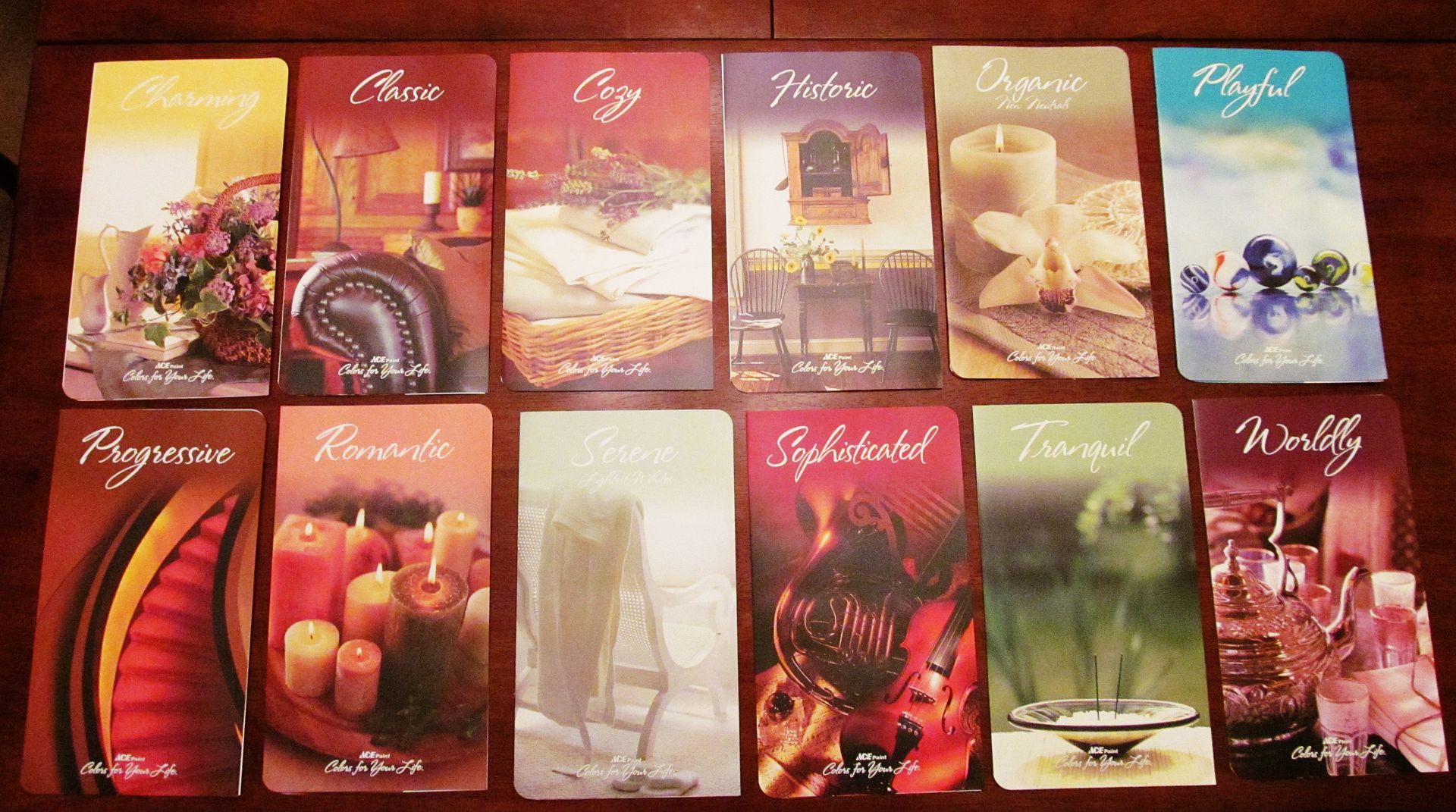
On my last visit to Lowe's I noticed that Olympic and Valspar had put out some chip cards I hadn't before seen. Olympic now pairs some photos with the paint chips on their cards (top middle of the pic here), while Valspar has trio sets of colors with little windows in them (top right.) Wal-Mart also had large sheet-style paint chips that were self-adhesive to stick on the wall and preview what the paint would look like (bottom middle.)
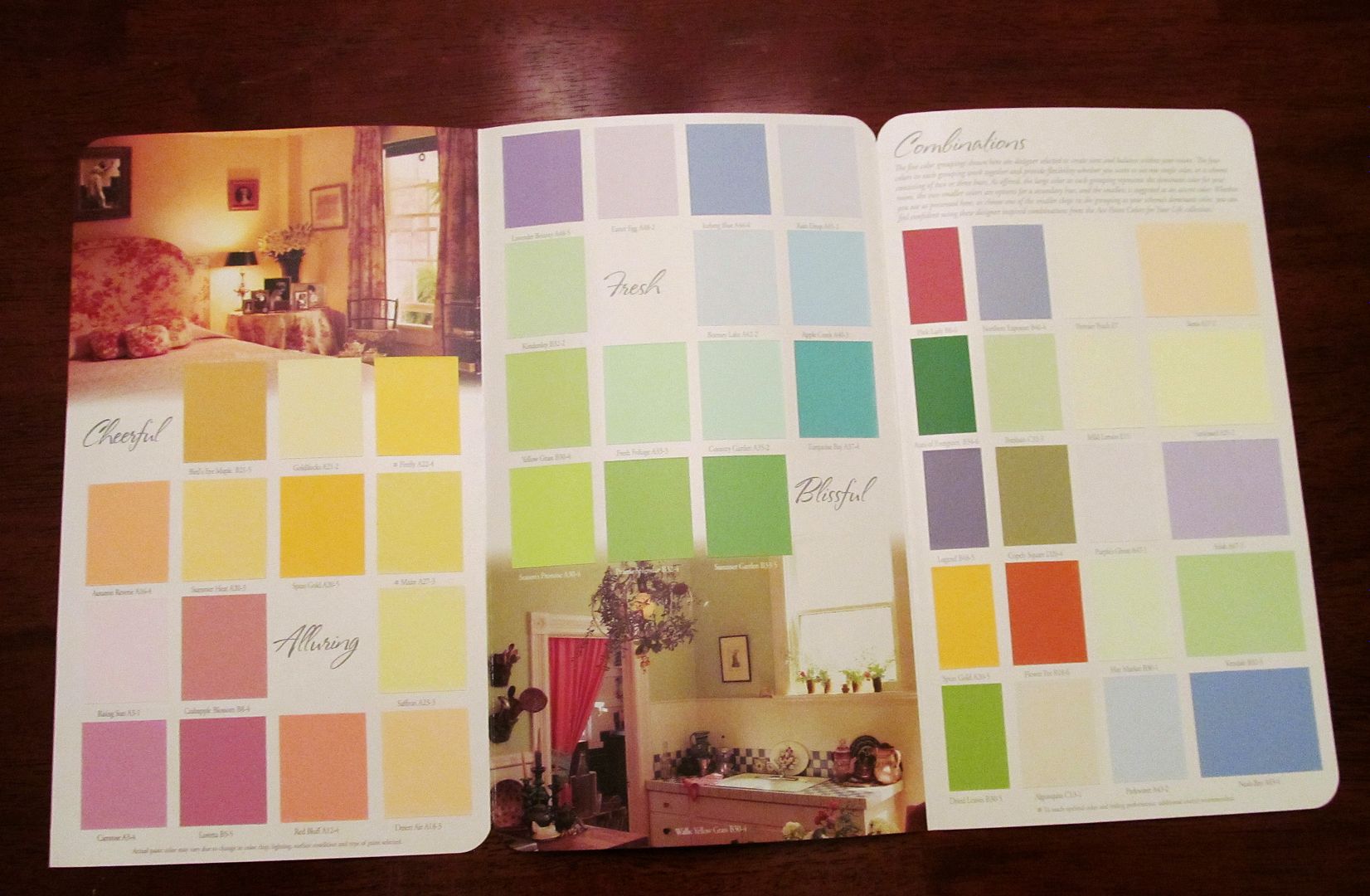
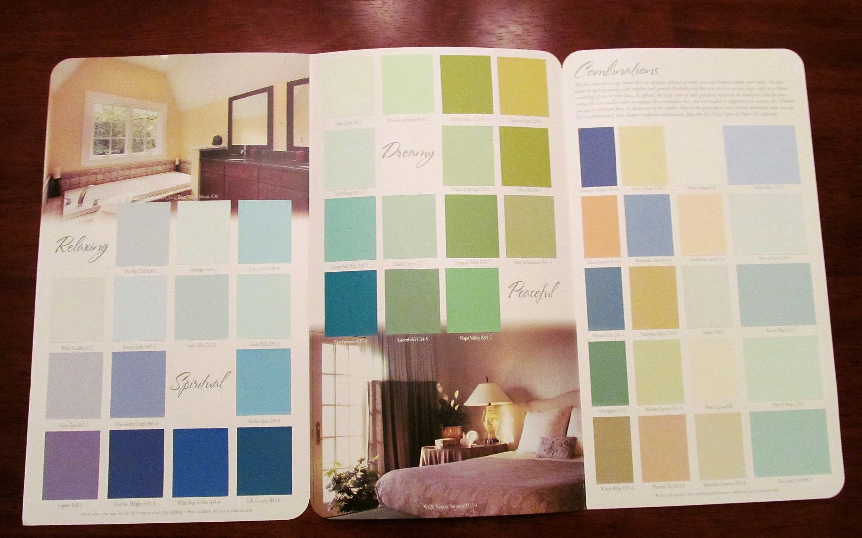
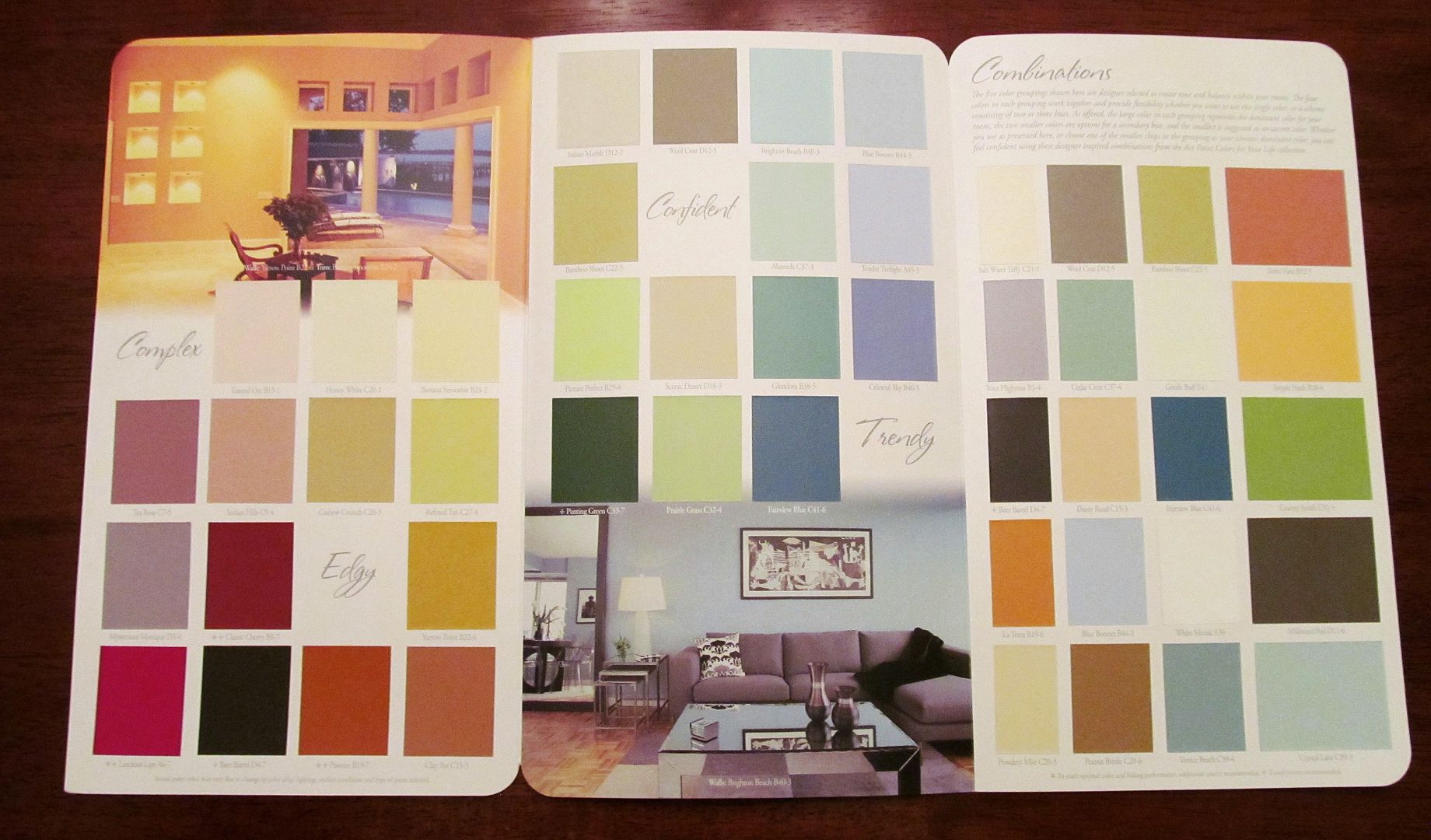
I collected samples of everything I liked (and I am planning to redo the guest bathroom, so I chose colors I'd like to try in that room) and brought them home to have some fun. Since I made some notepads out of paint chips earlier this month I thought I might see what I could make out of this batch. Olympic's photo paint chip cards have lots of lovely, serene images on them so I started with them.

These would be great for easy-to-make bookmarks if you cut off the paint chips and glued the strip of images to scrapbook or heavier-weight craft paper, but I was a bit more ambitious. First I trimmed the cards to separate the images from the paint chips, and then glue-sticked the image strips in four rows on a sheet of old card stock from the paper recycling bin.
Stacking them together in harmonious colors created a collage effect that I liked a lot:

For the first collage page I unearthed an ancient pack of computer stationery and a torn book board from my recycle bin and trimmed them down, punched holes in them and fastened them together with two binder rings. Now I have a bigger notebook for my desk, which I actually needed, with paper that is nice enough to use for correspondence. With the support of the book board backing I can also use it while I'm walking around the house and muttering to myself as I work out a scene.
For the second collage page I cut in half some 140lb. coldpress watercolor paper left over from the kids' school days, and used the same hole punch/binder ring approach to making myself a nice-sized watercolor journal.

For the windowed paint chip cards I settled on making some smash books to store swatches of fabric from my quilt projects. I took the paint squares I trimmed from the Photo cards and glued them over the windows from the back, then cut some old 12 X 12 scrapbook paper into six 4" X 5-1/2" pages. After holepunching everything I used a knotted piece of scrap ribbon as the binding:


While all the materials I used to make these are all recycled the end result turned out like something you'd purchase from that fussy journal section in big book stores. These two pain chip books were also easy and simple enough for kids to make, although I'd recommend adult supervision if they use a paper trimmer, scissors or any other sharp-edged objects.
If you're interested in doing something else with your paint chips, BrokeandHealthy.com has 50 projects here. I like ChicaandJo.com's paint chip mosaic greeting cards -- you could easily do these in holiday colors.
Have you done anything interesting with paint chips? Let us know in comments.
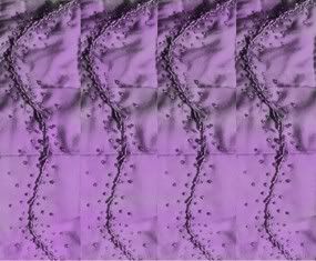 While I was reading the April/May 2012 issue of Quilting Arts magazine I was tempted by their reader challenge to create a "signature color" piece. Making an interesting monochromatic quilt takes some imagination, especially if your signature color is dark like mine (violet), but it wouldn't be a challenge if it were easy.