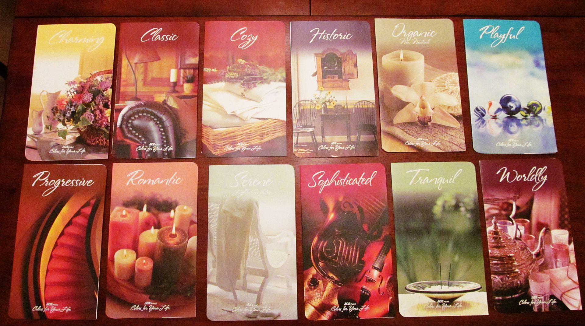
The charts are for ACE's Colors for Your Life interior paint, but what's interesting is how they put together the palettes. Each folder is named with a theme word, and I picked up the charts for Charming, Classic, Cozy, Historic, Organic, Playful, Progressive, Romantic, Serene, Sophisticated, Tranquil and Worldly. Inside the tri-fold pages are 48 different colors to represent the theme word, but they're further subdivided into different moods:
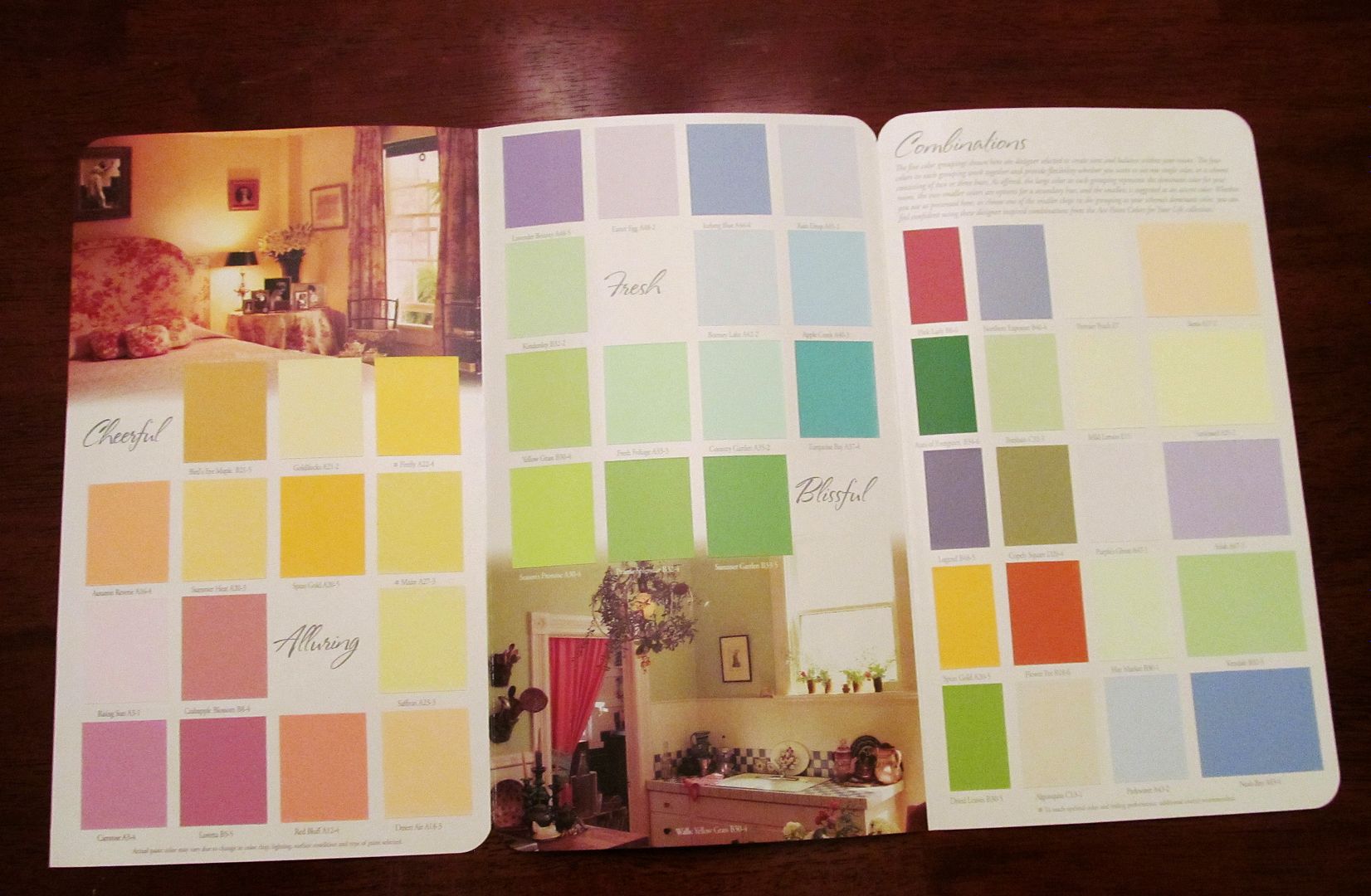
This chart, themed as Charming offered combinations of nine different shades with sub headers of Cheerful, Alluring, Fresh and Blissful. There were also other combinations on the right side foldout page to give you some alternative colors and grouping ideas for your Charming palette.
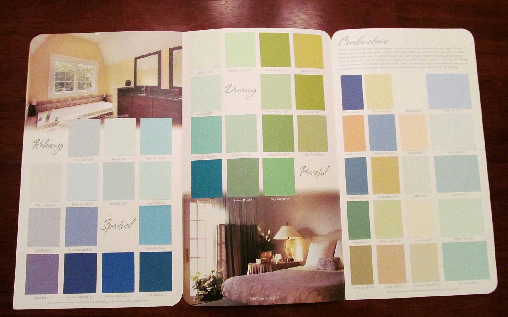
I really liked the Tranquil chart, which offered Relaxing, Spiritual, Dreamy and Peaceful shades of the sort of sea and sand colors I like best:
The Progressive chart had an interesting mix of bold and soft colors subheaded by Complex, Edgy, Confident and Trendy:
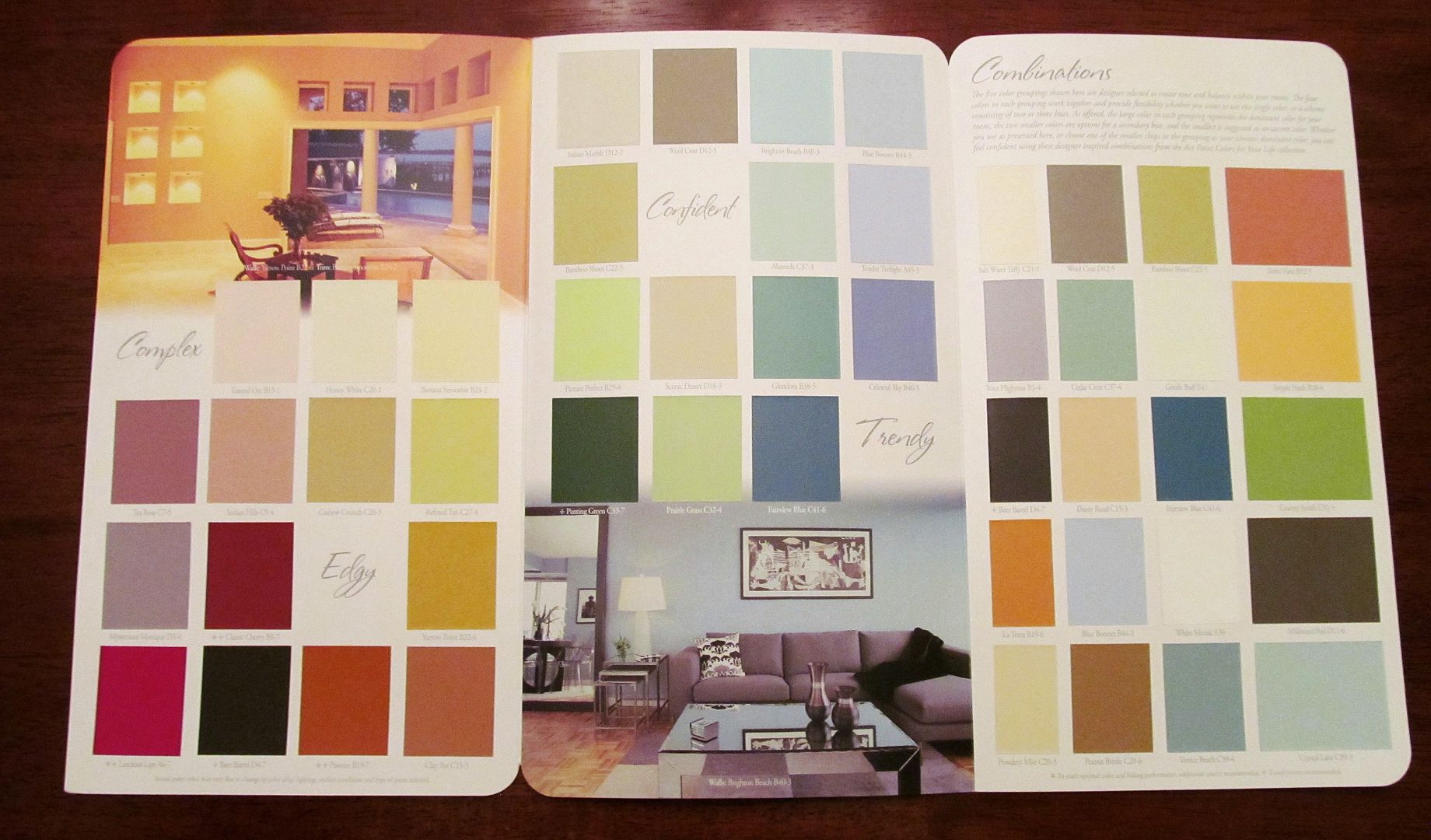
Some of the individual shade names were quite inventive, too. I responded immediately to Crystal Lake, Peace River, Moongrass, Prince's Robe and Mysterious Monique, which along with their particular shades almost begged to be written into a story.
I've talked about how to use color palettes to inspire characters and story elements, and you can find paint charts at any home improvement store. I think ACE Paint charts could be especially helpful to writers who want to try working with color palettes for their stories but aren't quite sure how to put them together. While I don't agree with all of ACE Paint's ideas on color themes -- the Romantic chart, for example, relied heavily on pink, a color which immediately invokes for me Barbie, breast cancer, cover art disasters and/or indigestion -- most of the groupings do fit the theme. Some may even surprise you.
For those of you who want to refine the visual aspects of your settings, each of the ACE paint color charts also show at least two room shots with examples of how an individual shade or a group palette works in an actual setting to invoke the theme mood.
The next time you're at ACE Hardware, stop by their paint department and pick up some charts, and see how they inspire you to create some new color palettes for your stories.

Clever idea and I can use it to match colours for my quilt too! Colour matching is a new field for me so this visual really helps.
ReplyDeleteI use my color palettes for quilting theme ideas, too, Fran, and they really help get me out of my tendency to use mostly darks.
DeleteI love paint color charts and have a multitude in my sewing cabinet, not only for the colors, but also the names (and what a cool job that would be!) ;D
ReplyDeleteNow I must plan a trip to ACE...
I love the names ACE's marketing folks have given their lines -- some of the most creative I've seen in a long time.
DeleteCharts are good. I love examples of blending colors together (4 or 5 together). I also tend to check out the colors on wikipedia. You get a chart with various shades of color and names.
ReplyDeleteThanks for the tip, Beth -- I didn't know about the wikipedia charts.
DeleteI like hardware stores anyway. Now I have another reason to do some prowling around.
ReplyDeleteI'm on a first-name basis with everyone who works in the paint department at Lowe's, lol.
Delete