Over the years I found what worked best with editors is to send sample images along with the cover art ideas. Here are two art idea outlines that I put together for my editor at Pocket to show him what I thought would look great on my books:
Harry's Charm cover art ideas
Clockwork Wolf cover ideas
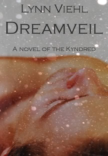
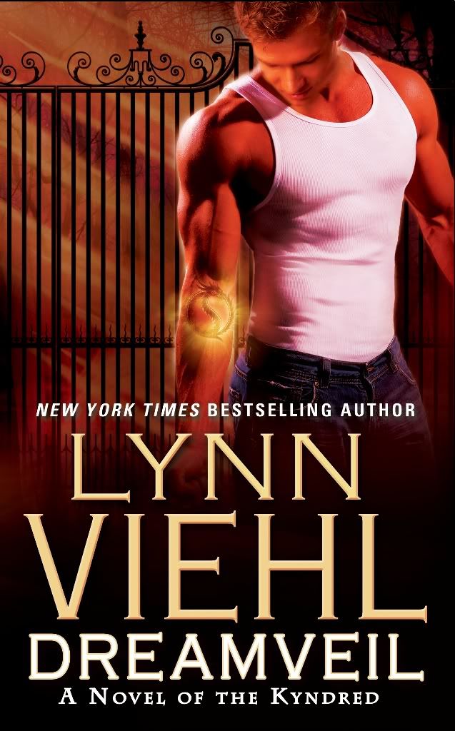
Unfortunately none of my ideas were used for the final covers, but what I like and what is marketable are often two very different things, as you can see here with my cover concept for Dreamveil, and what actually ended up on the the cover:


Still, it was fun to put them together, and it was nice of both publishers to invite me to contribute my ideas.
If you're ever asked for cover art input, here are some tips:
Consider your brand -- if you want to set yourself apart from the herd, go for ideas that present an original look.
Make up a prototype -- to add visual impact to your presentation, make up a mock book cover like the one I did for Dreamveil that incorporates your idea.
Offer more than one idea -- it demonstrates you're flexible, and fixating on a single cover concept almost guarantees disappointment.
Refer your favorite artist -- I often recommended artists I love to publishers; if you have someone in mind provide contact information or a link to their web site.
Think about color -- when I was publishing the original Darkyn series my ideas for color themes made it onto two of the books, Night Lost and Evermore.
One final tip -- if an editor ever shows you example covers and asks for your feedback, no matter how lame they are, try to be polite. I was once very candid about how much I disliked all the cover art examples an editor sent me, and I didn't bother to mince my words -- at which point she got very miffed and informed me that she had picked them out because they were all her favorite types of covers.

Excellent points. I'd also add that if you plan on writing a series, think ahead to what would make a good visual that ties all your stories to that series. It could be color, a model, an icon, or even the typography.
ReplyDeleteI notice the word 'pink' does not appear anywhere on this page...still twitching? ;)
ReplyDeletei have a very good artist who does my lovely covers now. I do have to hunt down source images/stock for her, or uh, cajole friends into doing stock modelling ( 2 covers are of friends).I'm just compiling the info she needs for a short that's getting put together for dragoncon again for me. Found stock. have an idea of what I want for color and 'look" and I let her go to town on it and she never disappoints.
ReplyDeletethree of the books were done by her and I love the consistent "look" and even the first one, which another artist knocked out of the park, gets compliments too.
But always in my head, your "pink cover" tale haunts me. indeed. ( the covers were what pulled me into your first books, and the back cover got me really hooked and lo...here we are.)
All of my e-publishers ask authors for initial input/examples on what types they liked.
ReplyDeleteAnd not a single cover came anything close to what I suggested, lol.
However, they were open to feedback on making what they DID select marketable and appealing to me.
I'm not a writer, just an avid reader and I find covers very annoying. Often the people of the front cover who you assume are depicting the hero/heroine of the books are nothing like the description given by the author. I often find myself wondering if the publisher actually read the story. One in particular springs to mind as the female on the cover was white skinned with red hair and the character was supposed to be of mixed race, with coffee coloured skin and black hair - duh? I guess I'm a visual reader because I look for covers that intrigue me then read the blurb on the back, and make my decision to buy based on a combination of the 2. Your Dreamveil cover was more in keeping with the title (and would have been an instant pick for me), but I expect the publishing company thought more women would buy the book if it had a hunky male instead. What's even more annoying is that the covers change half way through a series or you buy a US released book instead of the UK version (covers are different but why? I don't know). And the covers that have absolutely no connection with the story just bug me rigid. I'll shut up now..
ReplyDelete