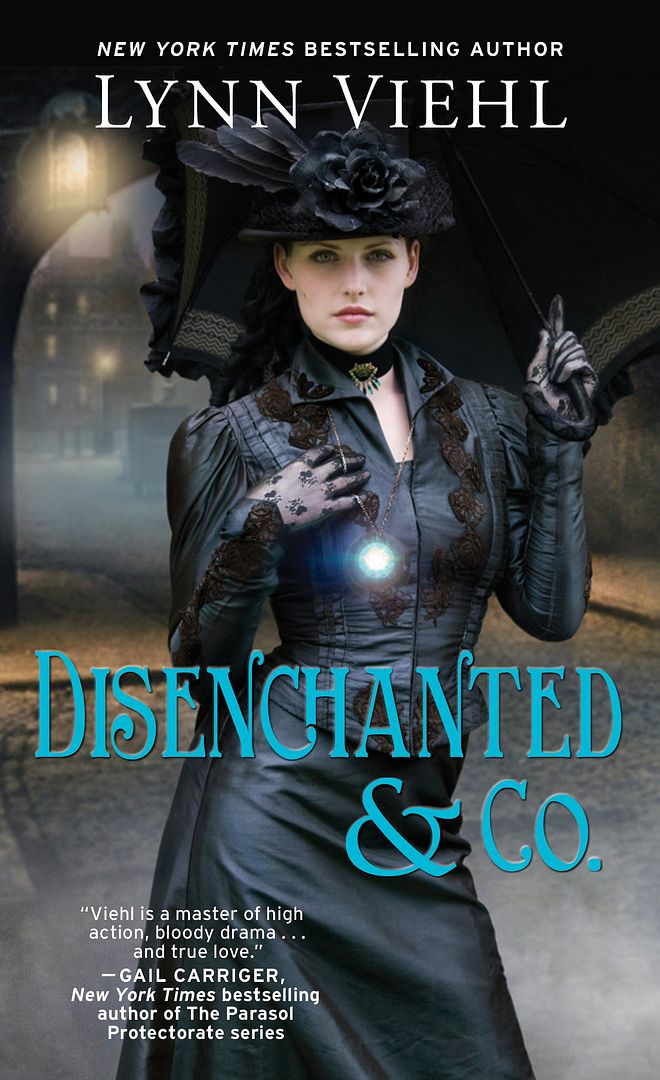
Also it seems that the title for the next book in the Disenchanted & Co. series will be my original title, The Clockwork Wolf, as that's how it is being listed on the bookseller sites.
Finally for the Friday video, we have Simon Christen's gorgeous short film Adrift. If time ever took form, I think it would look like this (contains background music, for those of you at work):
Adrift from Simon Christen on Vimeo.
(Video link swiped from Gerard over at The Presurfer.)

OK, I give up. What IS the difference between this one and the one you posted a few days ago?
ReplyDeleteBecause I'm just not seeing it. (And yes, my track record *is* pretty hit and miss at those "spot the difference" puzzles...)
Title and layout are different... ;D
DeleteOops, sorry. I was comparing this print edition to the cover for Her Ladyship's Curse...
DeleteYou can see the differences between the two covers here: http://i259.photobucket.com/albums/hh289/LynnViehl/Paperback%20Writer%20III/PrintEditioncomparison_zpsfbce40b5.jpg
DeleteMany a time I've been under that SF fog, but how beautiful to be above it!
ReplyDeleteI spent almost a year living with that fog back in the eighties, but never got a glimpse of it from this perspective. :)
DeleteI think the covers for this series are gorgeous, but I second Shawna, I just don't see the difference :).
ReplyDeleteStephanie
You can see them in this comparison: http://i259.photobucket.com/albums/hh289/LynnViehl/Paperback%20Writer%20III/PrintEditioncomparison_zpsfbce40b5.jpg
DeleteWhew! I thought it was just me. I don't see it either.
ReplyDeleteI think everyone is looking for artwork changes when it's more about the fonts, Alice.
DeleteI just found the first 2 books on Net Galley. I so happy to see them & I hope I can snag them. I don't check your blog as much as I like so I only found about this series by browsing on Net Galley. The description sounds interesting and the covers look great! :)
ReplyDeleteYay - I was able to get them!
Delete