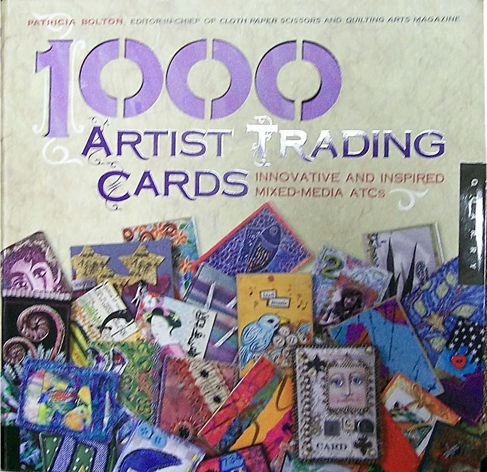
 Last year I began collecting ATCs, or artist trading cards. Those of you who hang out at sites like Etsy.com or Quilting Arts are familiar with these miniature wonders, which are 2-1/2" X 3-1/2" one-of-a-kind works of art. Recently I snagged a copy of Patricia Bolton's 1000 Artist Trading Cards, which offers detailed photographs of, yep, one thousand ATCs along with some helpful instructions on how to make them from different materials.
I've also been fooling around with making my own watercolor, photograph and quilted ATCs (click on the images to see larger versions):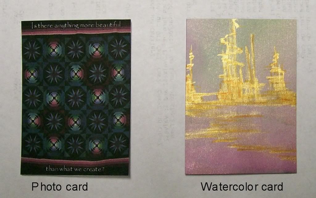
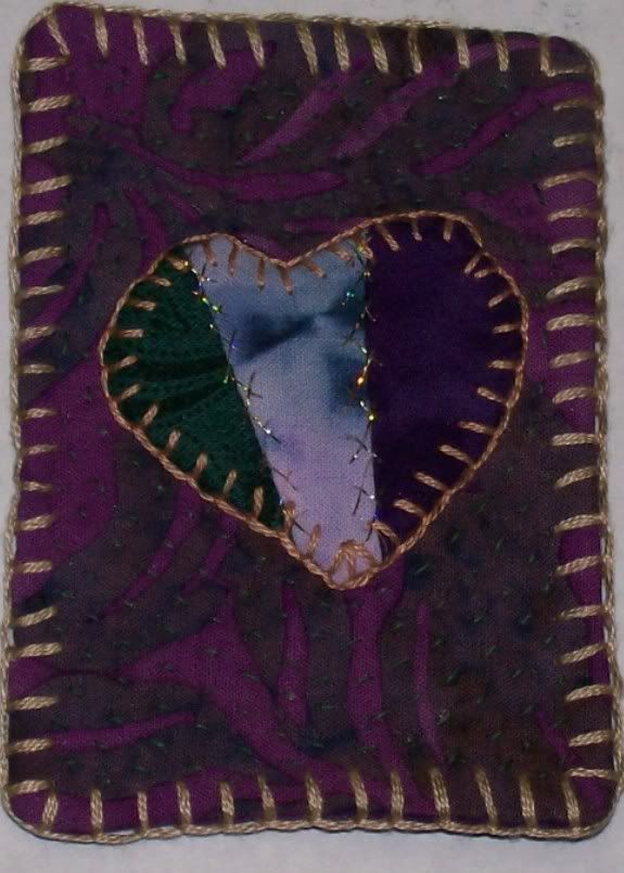
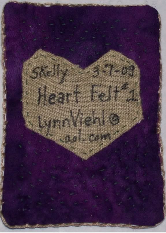
This has mostly been just for fun, but the more I think about ATCs, the more I want to see what writers and bloggers can do with them.
Last year we talked about using an online generator to make character cards as a fun way to remember our character stats and possibly to serve as a form of self-promo to hand out at signings and conferences. I think we can get more out of it, though; possibly come up with a writer's version of the ATC -- a writer's trading card.
I've seen writers handing out business cards and fridge magnets with cover art, release dates, ISBN#s and so forth, but I've never had a writer hand me a card with a quote or mini-excerpt from a story on it. Since words are our art form, I tried making a card with some of mine: 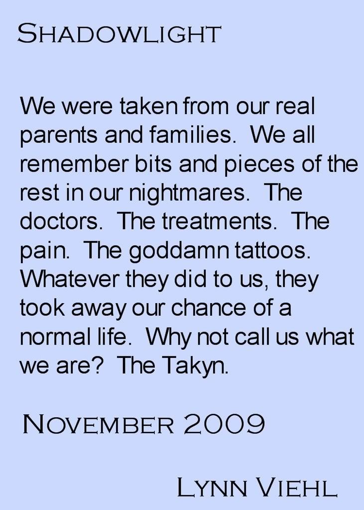
One problem is size -- you can't fit a lot of text onto trading card. Even with the smallest readable font, I'd say fifty to seventy-five words, max. With such a small space, the temptation is to write a teaser instead of using an actual excerpt. You could fit on a card a URL to an author's website, blog or an longer excerpt posted online -- but what's going to make the recipient curious enough to check it out? A great hook line or hot premise, i.e. "She knows your darkest secret" or "See what everyone is hiding" Or maybe a one-line joke? "This is why I didn't get the laundry done for three months."
Another problem is the visual aspect -- words aren't exactly colorful or attention-catching. I think using weird fonts in other-than-black shades makes the text hard to read, and any background image would have to be very light, semi-transparent or somehow muted to keep it from overwhelming the words. Unless you used an image on one side and words on the other.
I don't know. I've been thinking it through for a couple days now, and I'm a bit frustrated. It's as if there's an answer dancing just outside my brain's reach. What I do know is that these cards would be simple for a writer to make, print out, swap and otherwise distribute. The trick is to figure out what to put on them to make them a) one of a kind, b) irresistible to readers and c) potentially collectible.
I probably need to let the idea percolate for a while, but in the meantime, what do you guys think? Good idea, bad idea?
Related links:
Author Joumana Medlej has an amazing page with all you ever wanted to know about ATCs: Art in Your Pocket: ATCs.
Artist Trading Cards ~ a Collaborative Cultural Performance
Added 3/13/09: I removed the acronym for writers trading cards because a visitor reminded me of what else that acronym stands for, and I apologize for not realizing it until after it was mentioned.
Sunday, March 08, 2009
ATCs
Subscribe to:
Post Comments (Atom)

OMG, I LOVE this idea. I paint ATCs as well as write, but the idea of combining the two just never hit me.
ReplyDeleteI can see many possibilities. One, you could just make ATC sized shiny ads, with your bookcover on one side and a quote plus your website on the other. Cute, but not one of a kind.
Two, you could commission a painting of one of your characters (one per card) and then do a limited edition numbered run (12, 100) and give them away in contests or whatever.
Three, if you're an artist, you could paint your own and sell the original.
The cards could focus on a character, a scene, or reproduce the cover (you may have to make sure you have the rights to use it). But even if you have a quote on one side, have a picture on the other.You could hand-write a different quote on the back. You could also sign the back.
That sounds like so much fun.
(And hey, shameless plug, if you want an artist willing to work for free, I'm available! http://tara-maya-cover-art.blogspot.com/)
I'm inclined to suggest you look up YouTube and check into some of the kinetic typography. It's only marginally related in the sense that I think it's a decent case for somewhat more interesting uses of non-standard fonts, myself.
ReplyDeleteWhat struck me in reading this is why not use both sides? So the front could be the cover art, or one of your unique ones with the website link at the bottom, then a quote on the back so it has both a visual and written tease?
ReplyDeleteI make these often. The last set i made, I glued on a tiny envelope in which was a 100 word Harold and Jasfoup(the characters from my books) drabble.
ReplyDeleteThis is such a good idea. Businesses get business cards and clearly artists get artists cards. But the difference with those is in some ways you *know* what you're looking for. You have a webdesign business' business card because you want a new design, an artist's one because you want something to hang on your wall. But writers need something just that bit different to, as you say, act as a hook, because people *don't* always know what they're looking for in books. So your card is a way to show them that YOU are what they're looking for...Or something less cliché.
ReplyDeleteIn my other life I'm an art director.
ReplyDeleteI think excerpts are a terrific idea (if they are short). It has to grab at the very heart of the scene you want to express. The font also has to be readable.
Ref: visual aspect
If it were me, I would ghost an image in the background, probably around 20% density and put the excerpt over it. It should give you
color, depth and some indication of what the book is about.
I love the idea. Jenny Rappaport has been experimenting with Twitter stories : http://litsoup.blogspot.com/2009/03/twitter-story-3.html
ReplyDeleteSeems like this is almost a low-tech version.
And I can certainly see a combination of words and images - haiku, flash fiction and, if you're marketing a particular book, a teaser, as you say.
Am now very tempted to make a watercolor trading card. I'm not sure what the answer is for WTCs; maybe a combination of an image or texture with a one-sentence summary? Hmm.
ReplyDeleteLynn,
ReplyDeleteI agree with a few people. Why not use both sides of the card? The teaser comments on one side, then either a picture or a picture shadowed in the background with the book title and release date, your name (obviously) and blog site. I think this is a great way for an author to distribute their work. (But no pink!)
Tami
Jacksonville
Tara wrote: Two, you could commission a painting of one of your characters (one per card) and then do a limited edition numbered run (12, 100) and give them away in contests or whatever.
ReplyDeleteI like this idea, Tara. Doug Clegg commissioned an artist to do a special jacket for his first Vampyricon novel, if I remember correctly, and the artwork was fabulous. Also, you'd have something instantly collectible.
Anonymous wrote: I'm inclined to suggest you look up YouTube and check into some of the kinetic typography.
ReplyDeleteAnon, I'll ask my son about this -- he's the YouTube expert.
Margaret wrote: What struck me in reading this is why not use both sides? So the front could be the cover art, or one of your unique ones with the website link at the bottom, then a quote on the back so it has both a visual and written tease?
ReplyDeleteI agree, although I was hoping to think of a way to make our words into art -- even thought of cutting up a page of a manuscript and doing something with the typed words. Although that may end up looking more like a ransom demand. :)
Rachel wrote: I make these often. The last set i made, I glued on a tiny envelope in which was a 100 word Harold and Jasfoup(the characters from my books) drabble.
ReplyDeleteI've seen "pocket" type ATCs in Pat Bolton's book with tags and such placed in them that can be removed. Love the idea of putting and excerpt in an envelope -- or maybe a mini-book?
Amethyst wrote: But writers need something just that bit different to, as you say, act as a hook, because people *don't* always know what they're looking for in books. So your card is a way to show them that YOU are what they're looking for...Or something less cliché.
ReplyDeleteSpinning off Rachel's idea, what if you made a pcket ATC out of the cover art or something representative of you the writer, and then included a mini chapbook or (folded) excerpt for the reader to check out? Too much?
Maria wrote: In my other life I'm an art director.
ReplyDeleteI was hoping some pro art people would weigh in. :)
I think excerpts are a terrific idea (if they are short). It has to grab at the very heart of the scene you want to express. The font also has to be readable.
Agreed. It should be as simple to read as the info on a business card, imo.
Ref: visual aspect
If it were me, I would ghost an image in the background, probably around 20% density and put the excerpt over it. It should give you
color, depth and some indication of what the book is about.
Sometimes I like snips of the cover art versus the whole thing. If we were to take a piece of the cover or a symbol or something like that, I think it would enhance rather than distract. I'll try the 20% density setting and see what I can produce. Thanks, Maria.
Suelder wrote: Seems like this is almost a low-tech version.
ReplyDeleteAlthough I know its become the new writer fad, I've not kept up with Twitter at all. Tom and I had been using it as a message archive for our texts to each other until people started e-mailing me asking about the texts, and then we dumped it.
And I can certainly see a combination of words and images - haiku, flash fiction and, if you're marketing a particular book, a teaser, as you say.
I'd like to steer clear of the usual author promo type teaser with this idea because then it just becomes anonymous advertising that has no collectible appeal. But poems, flash fiction, or anything that interests the readers would be great.
Charlene wrote: I'm not sure what the answer is for WTCs; maybe a combination of an image or texture with a one-sentence summary?
ReplyDeleteI was trying to think of what grabs my attention when I browse in the bookstore. Attention-grabbing cover art only goes so far -- if the copy or the first couple of pages are lame, I don't buy the book no matter how beautiful the cover is. I think whatever words we use on WTCs will actually be more important than any images, although like cover art we can use visual elements to first grab attention.
We haven't discussed texture, which is an ATC dimensional element that I really love. One of the cards in the Bolton book is a seascape, and the artist covered half the card with fine tulle and made an underwater "pcoket" in which she put some floaters (beads, shells, or any tiny loose object.) I find that kind of ATC fascinating, and wish there was something dimensional we could to with art/words to suit storytelling -- like Rachel's tiny envelope.
Tami wrote: I agree with a few people. Why not use both sides of the card? The teaser comments on one side, then either a picture or a picture shadowed in the background with the book title and release date, your name (obviously) and blog site. I think this is a great way for an author to distribute their work. (But no pink!)
ReplyDeleteUnless they write chicklit. Then they can borrow my last cover. Ha.
I have a different opinion about the fonts. You wanted big font and therefore 50-75 words. However, I don't think small font is a problem. Have you seen the font on pokeomon cards? Tiny!
ReplyDeleteMy oldest son made these for art club last month. They get to trade them every Tuesday morning before school. It was my favorite project of the year. Very fun for the kids and it made me want to make some of my own.
ReplyDeleteWhat about post card sized? I did a postcard for my poetry collection. On the front was a reproduction of the cover, the back I chose to highlight a single poem. It's still small enough to use as a bookmark, large enough so that you don't need a microfont and if you wanted to, you could send them in the mail as is.
ReplyDeleteGreat idea to make these collectable.
What a facinating promotional idea. Brainstorming here.
ReplyDeleteYou want high recognition value hense the concept of the cover art. I don't have all the art vocabulary. I see it like a background watermark (play with the density).
The words over the top. There doesn't seem to be room for much. Anne LeClaire challenged us at a recent workshop to come up with 25 words that capsulated our story, think elevator pitch!
The backside of the card could have snips of author info, maybe a line or two of bio and then social networking sights for fans. Maybe a favorite quote or a classic line from one of the character's dialogue. Every so many cards on a run that quote could change making variety and different cards to collect in a series.
That way the card becomes a collector on a multitude of dimensions. Collecting one for each book of a fav author. Collecting different fav quotes of the author or dialogue lines.
Just look at what the marketing/media did with "What if I'm not the hero. What if I'm the bad guy"
Fantastic Idea this morning.
Eden Glenn
www.edenglenn.wordpress.com
www.thewritivators.blogspot.com
What a neat idea. You can use ATC pockets like these and decorate them, then you have the actual ATC on the inside. Adds lots of space for design (you have the pocket and the ATC) and it's unique enough to be remembered. I can't wait to see what you come up with!
ReplyDeleteHey, Lynn? What about that word generator thingy you like to play with and which I needed to leave alone because I found myself playing with it for hours ;) Wordle is it? Something like that would look cool on a card.
ReplyDeleteI like the transparent background idea too.
Perhaps we’re thinking too small. Maybe thinking of the team rather than just a player would be helpful. Create a short story in 12 short parts of 50 or 60 words, each card would hold a section. Then, you would have to hand out the card at different times. On the other side would be some business information--a short bio? This way, to get the whole story people would have to collect the cards, and trade for the cards they didn’t have.
ReplyDeleteAlso, It would be interesting if you didn’t tell readers how to order the story. Let them do it on there own. This could enable you released cards later in the series that really belonged in at the beginning and sifted the whole story in another direction. The movie Memento was good at this.
I've been playing with this kind of idea for the past couple of weeks, only as a collectible bookmark. Now I have so many more things to try. Thanks, everyone.
ReplyDeleteMargaret wrote: I have a different opinion about the fonts. You wanted big font and therefore 50-75 words. However, I don't think small font is a problem. Have you seen the font on pokeomon cards? Tiny!
ReplyDeleteI can't see the font on Pokemon cards. :) But point taken; we could probably fit more text on the ATC if we use a smaller font.
Wow! Awesome post. I popped in over here to post this Award announcement and learned a ton. Thank you very much for this post...
ReplyDelete~~~~
I just wanted to let you know that your blog was nominated for an award by the ladies at Petit Fours and Hot Tamales. If you want to play along, you can read about it at http://petitfoursandhottamales.blogspot.com/search/label/Awards. Whether you accept or not, we do thank you and your blog for sharing such wonderful information.
Have a great day.
Tami Brothers
(one of the 19 authors at http://petitfoursandhottamales.blogspot.com/)
Lynn said: I agree, although I was hoping to think of a way to make our words into art -- even thought of cutting up a page of a manuscript and doing something with the typed words. Although that may end up looking more like a ransom demand. :)
ReplyDeleteLOL! What an image. And the ransom is the purchase of your book. It would be a lot of fun for a mystery. Planning to write one of those some day?
Honestly, I like Maria's idea of the ghosting picture (especially considering your new covers), but the concept of making words into art dredges up comments of pink paper and perfumed envelopes sent to editors.
However, I can almost see doing something like the wordie cloud thing with the key points of the novel highlighted so it gives an artsy impression while also catching the attention of folks who are looking for vampires, fairies, love, adventure, what have you.
Lynn, I think your idea works great! I want to go out and get Shadowlight right away, based on your quote! (Let me guess, it won't be out till next year... sigh...)
ReplyDeleteGerry
You know, I ran with that character card thing last year and started making hero/heroine card sets for some of my books with the blurb on them and a stock photo, like this:
ReplyDeletehttp://moirarogers.com/gallery/albums/userpics/redrock-keith.jpg
http://moirarogers.com/gallery/albums/userpics/redrock-abby.jpg
I have had a lot of fun with it, and it all came from that original idea I had when you first posted about character cards. And I can fit two of them on a postcard from vistaprint (or two on an oversized magnet) so they turn out to be a nice cheap promo tool. So thanks for giving me the original idea. :)
Heather wrote: My oldest son made these for art club last month. They get to trade them every Tuesday morning before school. It was my favorite project of the year. Very fun for the kids and it made me want to make some of my own.
ReplyDeleteThat sounds so cool -- our school does bookmarks and mini-posters; I'll have to suggest this to the art teacher (Heather brings up a point for you YA authors out there to think about -- kids love collecting cards.)
LJ wrote: What about post card sized? I did a postcard for my poetry collection. On the front was a reproduction of the cover, the back I chose to highlight a single poem. It's still small enough to use as a bookmark, large enough so that you don't need a microfont and if you wanted to, you could send them in the mail as is.
ReplyDeleteMaking them in a mailable size is definitely a plus for authors who have an active mailing list. We could call them Super WTCs. :)
Eden wrote: The backside of the card could have snips of author info, maybe a line or two of bio and then social networking sights for fans. Maybe a favorite quote or a classic line from one of the character's dialogue. Every so many cards on a run that quote could change making variety and different cards to collect in a series.
ReplyDeleteI like the idea of a collectible series, Eden -- that would also help writers like me who have novel series and want to create WTCs for them. I could see doing a spin on the character card I did for Lucan/Dark Need last year showing his face from the cover art as a low-density background, and maybe a line of his dialogue from the story.
Scrappy Pam wrote: You can use ATC pockets like these and decorate them, then you have the actual ATC on the inside. Adds lots of space for design (you have the pocket and the ATC) and it's unique enough to be remembered.
ReplyDeleteI like the idea of a pocket with an ATC inside, too. Thanks for the link -- I might order some of these and play with them.
Theo wrote: What about that word generator thingy you like to play with and which I needed to leave alone because I found myself playing with it for hours ;) Wordle is it? Something like that would look cool on a card.
ReplyDeleteIt was Wordle (putting up the link in case anyone wants to go play.) I think it would work well on an ATC if you didn't use a lot of words in the Wordle -- maybe just some provocative tags or key words from the story. Thanks for the idea, Theo.
JC wrote: Perhaps we’re thinking too small. Maybe thinking of the team rather than just a player would be helpful. Create a short story in 12 short parts of 50 or 60 words, each card would hold a section. Then, you would have to hand out the card at different times. On the other side would be some business information--a short bio? This way, to get the whole story people would have to collect the cards, and trade for the cards they didn’t have.
ReplyDeleteThat's brilliant -- and a great way to get readers to trade cards, too. You know what it made me think of -- writing a short/ 3-5K prequel or sequel to a novel but handing it out only in a card series like the one you propose. Would work at reader conferences or to hand out at booksignings.
Darlene wrote: I've been playing with this kind of idea for the past couple of weeks, only as a collectible bookmark.
ReplyDeleteFor years I've been writing little messages and sayings on the back of bookmarks I've handed out, and I know a few of the readers thought they were fun, so don't discount the bookmark idea altogether. ;)
Tami wrote: Wow! Awesome post. I popped in over here to post this Award announcement and learned a ton. Thank you very much for this post...
ReplyDeleteWelcome, Tami, it's nice that you stopped in. I don't do these meme type awards, or any awards for that matter, but I appreciate the thought.
Margaret wrote: LOL! What an image. And the ransom is the purchase of your book. It would be a lot of fun for a mystery. Planning to write one of those some day?
ReplyDeleteI was a ghost writer for a lot of years -- who knows, maybe I already have. ;)
Speaking of mystery writers, a ransom demand type ATC would be a cool way to promote a book in that genre.
Gerry wrote: Lynn, I think your idea works great! I want to go out and get Shadowlight right away, based on your quote! (Let me guess, it won't be out till next year... sigh...)
ReplyDeleteIt is supposed to be out in November, Gerry -- which if the publisher doesn't change the date is only eight more months. And I should have some ARCs to give away in Septemeber or October here at the blog.
Moira wrote:
ReplyDeleteYou know, I ran with that character card thing last year and started making hero/heroine card sets for some of my books with the blurb on them and a stock photo...
Wow, you're way ahead of us, Moira (I really like both cards, but the one for Abby is especially gorgeous.) I think I remember a couple of writers (Shiloh Walker, for one) taking the character card to the next level. Great job.
What a cool idea, and I like having another way to turn my mental ideas and written words into something visual. It really sparks my creative juices.
ReplyDeleteLooking at the type-only sample in this post, here's a suggestion to help any type you want to put on it look better, coming from someone who spent years working with graphic designers. After you end a sentence with a period, don't put two spaces before beginning the next sentence. I know it is a habit to do this - when I learned how to type on the old manual typewriter, it was a matter of course to use double spaces after periods. But on a wordprocessor/computer, fonts are designed to add just a tiny bit of extra space after periods. The double spaces aren't necessary, and in fact create a very large gap that detracts from the visual flow of the block of text. I've spent more hours than I can count removing double spaces from traditionally typed documents so that they could be properly laid out for design and production!
Last year I had what you could call trading cards made up fo all of my singel title books. I had them done becasue I found a really good sale on business cards, and then I put allone of each into a little plastic bag, and handed them out as "Collector Cards"
ReplyDeleteLOL You can see them here. The cover is one side, and the blurb and review quote is on the other.
http://www.sashawhite.net/press-kit/promotional-items/
Lynn, I have found Moo Cards! Have you seen them before?
ReplyDeletewww.moo.com
ATC's have, at times, saved my creative process. Daisy Dexter Dobbs makes them, too, and hers crack me up.
ReplyDeleteTwo comments:
ReplyDelete1. One of my friends (who just sold her first book) is using ATCs with hand-drawn pictures of her characters on them as things to hand out to people at cons to remind them of when the pub date is. It seems to be working really well -- they're incredibly cute and people actually hunt her down and ask her about the book so they can get one (that being the distribution method). So you don't really need words at all, if you've got some other method of publicizing what they are (and it gives people a reason to read the book -- to find out which character they've got if they don't already know).
2. On a less cheerful note, can we find another acronym? WTC for me will always expand to "World Trade Center," which is a bit disconcerting attached to an otherwise neat discussion.
Lynn wrote: I've spent more hours than I can count removing double spaces from traditionally typed documents so that they could be properly laid out for design and production!
ReplyDeleteThat's an incredibly helpful tip, Lynn -- thanks. :)
Sasha wrote: Last year I had what you could call trading cards made up fo all of my singel title books.
ReplyDeleteBeautiful cards, Sasha -- I love the way you designed them to be complimentary, even with all the different covers (which I envy greatly, I'll admit.)
Theo wrote: Lynn, I have found Moo Cards! Have you seen them before?
ReplyDeleteFirst time I've been to that site, Theo. Beautiful cards -- I will definitely cruise around Moo and check out more thoroughly what they have to offer -- thank you for the link. :)
Eva wrote: ATC's have, at times, saved my creative process. Daisy Dexter Dobbs makes them, too, and hers crack me up.
ReplyDeleteSame here, Eva. I'd love to see some funny cards. We need all the laughs we can get these days. :)
Aiglet wrote: One of my friends (who just sold her first book) is using ATCs with hand-drawn pictures of her characters on them as things to hand out to people at cons to remind them of when the pub date is.
ReplyDeleteThat's excellent, especially when you don't have a physical book in hand yet to show off.
On a less cheerful note, can we find another acronym? WTC for me will always expand to "World Trade Center," which is a bit disconcerting attached to an otherwise neat discussion.
I have to apologize; I didn't realize this until you posted your comment (and honestly, I appreciate the nudge.) Author Trading Cards would have the same acronym as Artist Trading Cards, so how about BTCs for Book Trading Cards?
Just to note -- I went ahead and removed the references to WTC and changed the post title to ATCs for the time being.
ReplyDelete