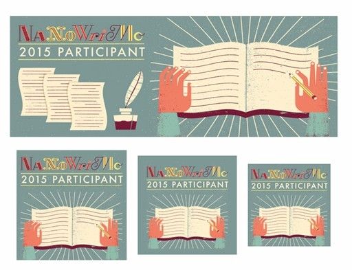
So it's not as awful as that one year when they went with the Gameboy-style design. I like the colors, but the graphics make me think more of writing journals than novels. The hodge-podge font is hard to read, and the design is on the clunky side (and before anyone asks, I was not the model for the crooked hands. Mine aren't that crooked.) On the other hand it's not as awful as that one year when they went with the Gameboy-style design.
What do you think? Let us know in comments.

Not that fond of this year's badge (the colour is fairly pale too) but then I don't always remember to post it on my site either... sigh.
ReplyDeleteRon B
It really does look more like journaling rather than writing. I don't know...jury's out, but I'm thinking overall, no.
ReplyDeleteI agree about the hodge-podge font. Difficult to read. The graphic does remind me more of journaling than writing.
ReplyDeleteIf you see the whole poster, it looks better. My 2.5 year old grand daughter likes it, if that counts.
ReplyDeleteNothing if not unclear. Or I'm just over the hill. Or both...
ReplyDeleteI'm not fond of it but then again last year I used yours with the turtle. LOL
ReplyDelete