Cover #1:

Cover #2:

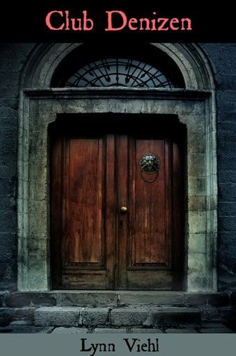
Cover #3:
Please let me know what you think in comments (and there are no wrong answers.)
Image Credits:
Mask by belchonok
Figure in Tunnel by eugenesergeev
Old Door by exile7
Writing Pro Since 1998

Original site content copyright 2004-2026 by Sheila Kelly
All rights reserved
Paperback Writer ISSN# 2159-9424
The one with the door is the most interesting one but I'm not sure what message you're trying to get across.
ReplyDeleteWhat I would do is move the door image to the top (removing the black band. Overlay the title on the door, extra large and in a typeface that reinforces the genre.
For example, a vampire story might use spiky type. A demon or immortals story might use flame, bones, or type that looks like stone. Even a standard font with some weight to it will work. You're looking for a strong, heavy font to give the cover gravitas.
There's a lot you can do with this image to make it stand out.
My two pennies. :)
I'm torn between number 2 and 3.
ReplyDeleteAlthough I prefer the second picture, I think the third fits the story best.
So my choice is number 3.
Lia
The mask and the door have a mysterious quality, making me wonder about the club. The middle picture makes me wonder about the man, who looks a little creepy. I vote for the door :)
ReplyDeleteI vote for the door, too. I fell in love with it at first glance, and I want to know what happens inside.
ReplyDeleteOf course, I might change my mind when I read the tagline. :-)
I'm going against the grain here, but I like #1 the best, followed by #3. I agree, the man is creepy.
ReplyDeleteNumber One is a bit "Phantom of the Opera" though I love the colors. Two...having read the story, I don't see how it fits. Three...I like the door, the mystery of it. It also matches the style of Win's private apartment upstairs, but does it look like the entrance to a sex club? Don't have a clue...
ReplyDeleteI really like the 3rd one. It has a very intriguing feel to it and if I saw it in the bookstore, I would pick it up and read the back cover.
ReplyDeleteLove the colors of #1...
ReplyDeleteBut I'd also go with the door, #3. It invites me into the story & I love the knocker.
The door as well (I've read the story and I'll have to pass this on to my wife). The font will have to carry the weight. Since it's a romance with crime, it needs to be friendlier because the door is creepy enough to cover that end.
ReplyDeleteI'd pick #3 as well. It has the feel of embarking on something interesting once you pass through the doors.
ReplyDelete#3 is my top pick, with #2 as a close second.
ReplyDeleteHaha, I think I'm the only one who likes #2 with the 'creepy' man (I thought he was mysterious). My next choice is #3 which seems to me more popular. I agree with Bill about the font. I just really like covers with images of people on them.
ReplyDeleteNo. 1 makes me think I'm going to be reading erotica, No. 2 a thriller and No. 3 a gothic horror. If you wrote it, I'd read all 3, but I think your choice depends on what kind of story you've written.
ReplyDeleteI "like" numbers 3 and 2 best in that order but I think that number 1 fits the story better. That said, I would only pick up that one because of your name on the cover. I really like the last one best and agree that the middle one is kind of creepy BUT it looks like a spy or horror novel. Maybe that's the look you're looking for? Whatever you decide I love the story and can barely wait for more.
ReplyDeleteLynn,
ReplyDeleteI like #1 and #3 (#2 is creepy) but how about a combination of both? Like have the mask on the steps going up to the door of Club Denizen? That way it gives a visual to the reader of what the club might be about. Getting away from yourself or being someone else.
Tami
Jacksonville
(I posted this before and I'm not sure if it went through. Sorry if this is doubled!)
Like 2 and 3 but leaning toward 2
ReplyDelete