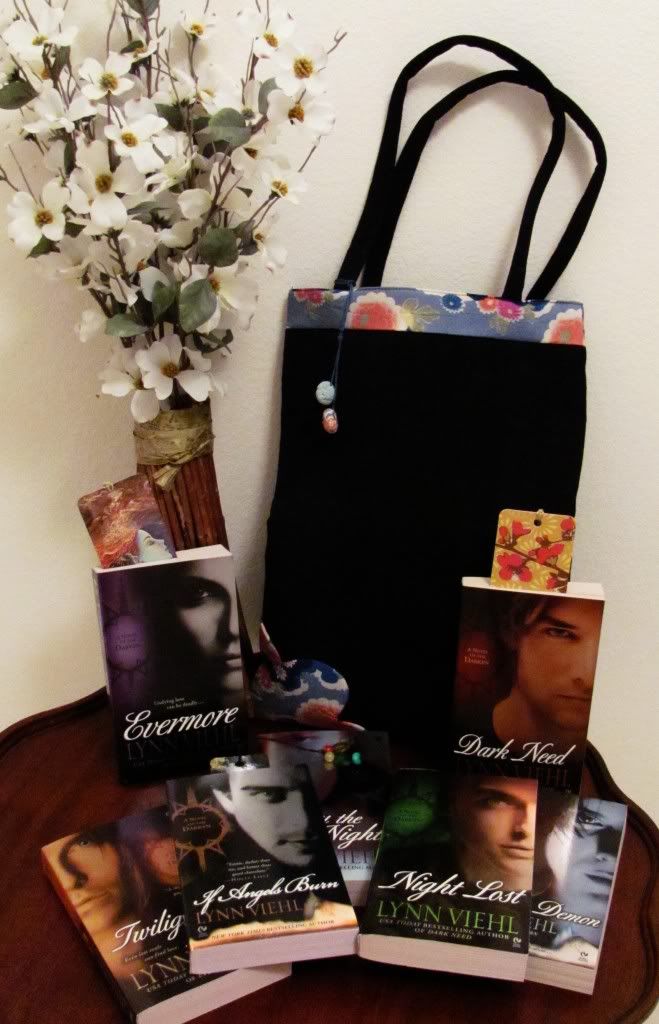
 Long before there were business cards or resumes people would make themselves known to each other via heraldry by displaying (usually on a shield) a family coat of arms. The practice, which may predate the Roman Empire, was both a way to show off one's pedigree and provide an instant form of identification -- something the probably came in handy on the battlefield. In the confusion being able to read with one glance the coat of arms on someone's shield may have kept more than one confused warrior from accidentally slaughtering an ally.
 Over time the coat of arms became synonymous with power, wealth and privilege, something to separate the entitled from the indiscriminately bred. It moved from the warrior's shield to the seals used for wax imprints and crests embossed on letters and documents. Sara Ferguson even had her family coat of arms embroidered on her wedding dress when she married Prince Andrew. Today heraldry is often misused by people who think that because they have a historic-sounding surname they might actually be the ninth cousin of the Duke of Wellington twice removed (btw, his surname wasn't Wellington. Wellington came from the name of a town in Somerset.)
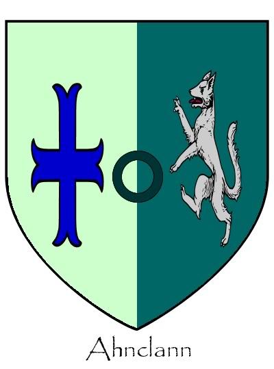
I like to play with heraldry in fiction; for the Darkyn series I employed several variations of it, from jardin colors to family crests. For the new trilogy I'm also putting it to work, so I'm back to researching the symbols and arrangements to see what I can use for my needs. Today I designed the above Ahnclann coat of arms (and not for any particular reason other than I just wanted to test the generator) by using the free online Java version of Coat of Arms Design Studio. I liked this generator because it had a lot of design options yet was simple to use.
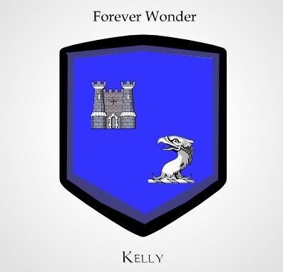 There are also product sites online which will let you design your own coat of arms and then (for various fees) will print it on T-shirts, coffee mugs and pretty much anything else you want. I took the online designer tools at MakeYourCoatofArms.com for a spin and made up a fictitious coat of arms and motto for my surname, which then made me curious as to what the real/historic Kelly coat of arms might look like. I ran an image search, and Yahoo brought up this impressive conglomeration ("God is my strong tower" seems to be the family motto. Or maybe it was "Gone Off to Our Ivory Tower" and someone tweaked it.)
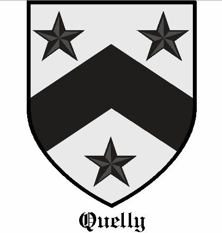 There are some great heraldry research sites online that provide an amazing amount of details. I found this real Quelly coat of arms at Eddie Geoghegan'sCoats of Arms from Ireland and around the World site, which is not just valuable for all the free heraldry info he offers; he also provides for free images of the coat of arms for more than 8,000 surnames, as well as an excellent crash course in the customs and practie of heraldry. Even if you don't need a real coat of arms, just looking through the collection can give you some excellent ideas on what to use when designing your own.


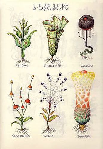 There are a few titles that I'd still like to add to my personal library someday. One is Luigi Serafini's
 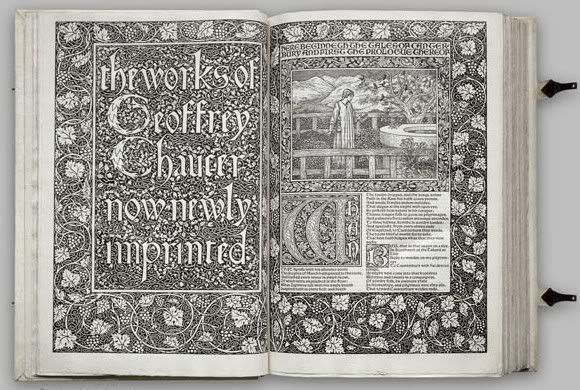 There are online sites like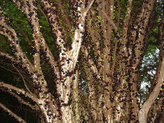
 I caught part of a radio interview on NPR the other day where a physicist was talking about the possibility of parallel universes, how matter can only arrange itself in a certain number of ways and why this virtually guarantees multiple versions of the same matter (thus if I'm writing this post in my universe, there are other PBWs in other universes who are doing the same or similar things.) Later, when I checked NPR's web site I saw the interview was really promo for his latest book (and you can listen the broadcast, read a condensed version of the concept and the first chapter of the physicist's book
 Why white? Her favorite color palette is like the old joke: what's black and white and red all over? Everything the kid owns. Her linens are scarlet and snow white, her room accents are onyx and everything else echoes that stark trio, even her vaguely Asian/Gothpunk wardrobe.
  For one of the novels I'm working on now I wanted to use some of the colors of Provence: dusty lavenders, autumn oranges, old ambers, slate blues. My guy had already brought home a stack of paint chip charts from the home improvement store for my daughter to look through (in case she changed her mind about the white), so I went to sort through them and see if I could find some chips that matched the palette in my head. Among them I found this lovely little pamphlet from Olympic Paint's Audubon Collection titled "Brilliance" which featured eight colors that would look completely at home in Provence (and no icky yellow, which surely had to be a sign.)
  Don't limit yourself to fabrics and paint chips for the story palettes you create. You can use photographs, scrapbooking papers, found objects -- if you can print, paint, sketch or glue it on paper, it will work. If you find an image online with colors that you'd like to use in a story palette, feed the URL to DeGraeve.com's Color Palette Generator. Along with html codes it will give you two rows of color swatches which you can print out and use for a palette page.
 Faceoffbook: A site on which you are not permitted to post any images of yourself or your body parts, which includes any/all Glamor Shots, sex act partials, meaningful personal symbols, short animations from porn movies or Seinfield episodes, pictoral-enhanced famous quotations, celebrities you secretly believe you resemble, participation in drunken revelries or anything that may be introduced as evidence against you in or out of a court of law. If you've used it as an avatar, you won't use it here.
 Muter.com: For people who don't own mobile phones, hate texting and/or prefer to hold all of their conversations in private without an audience. Welcome! Now, shut up.
 Unromantic Times.net: The premiere site for the unattached, happily single and not planning on getting involved with anyone ever ever ever. Members may freely communicate without fear of being matched on any level, having to meet, make committments or film a commercial that requires them to fake how happy they are together. Their motto: what's love got to do with it? Uh, nothing.
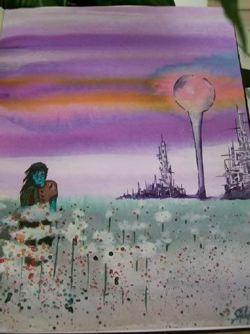 Visualization of a concept is an important part of writing for me. If I can see a scene in my head, I can write it, and my imagination is already pretty well-stocked with faces, places and things. Painting, sketching and photo-shopping also help when I have an idea I want to turn into a visual reference, particularly with settings and characters (as was the case with creating this watercolor from a StarDoc novel scene for a long letter I sent a friend.) Creating art is a great way to get to know the story element you're depicting and serves as a jog for little details that might otherwise slip your mind while you're at the keyboard.
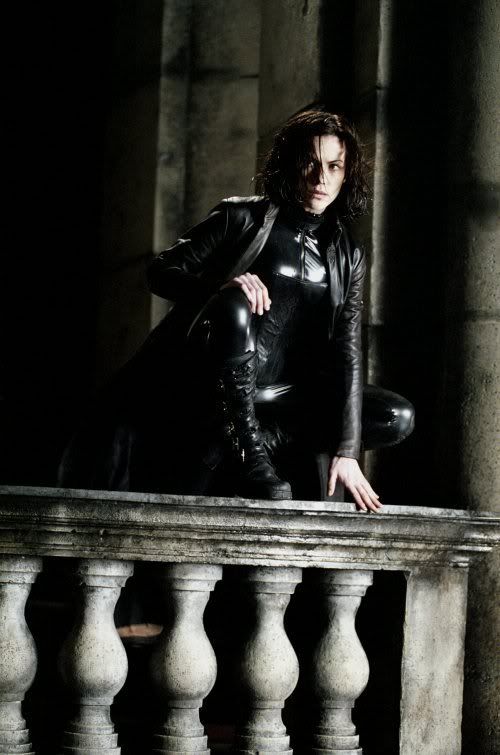 Style is all about the forest, not the trees, of imagery. One thing I really enjoyed about all the Underworld movies was the intricacy and consistency of the dark, bleak dystopian world of the vampires and the Lycan. Here's a still of Selene, the protagonist from the first two Underworld movies, and even something as simple as the marble balcony has that blackened, neglected look to it. Battlestar Galactica (the new series) was another show that offered incredible styling which suited the storyline and bucked the traditional bright-and-shiny Utopian soft-serve SF television shows generally deliver. Battlestar was gritty, realistic and very, very human, especially with the cast choices.
  Create a visualization journal for your project. Divide it into sections for different story elements: characters, settings, time period, theme and detailing are all good, but tailor it to what you want to explore visually. Then start filling it up with images that illustrate in any manner that particular element -- body models, architecture, paintings, sketches, found objects, fabrics or anything that relates directly to and/or enhances your vision. If there are keywords or notes you want to add, write them as captions to the images. Before you begin writing a scene, go through your journal and refresh your imagination as to the specific look you want.
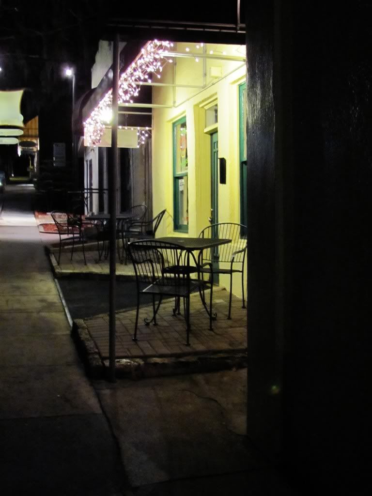 Take one location from your story and try to find one that is similar to it in your area. Pay a visit with a camera and notebook, and take some snapshots of details that you can use in your story. Write down notes on things you see that you didn't think of, and pay special attention to things like light, sounds, smells, textures as well as how being in that place makes you feel. This is a shot I took one night recently while getting some visuals on what a small country town feels like after the shops close and everyone has gone home for the night. Feels a little spooky, especially when dozens of bats began pouring out of one restaurant's chimney -- one place I don't think I will be in a hurry to make reservations at anytime soon.
 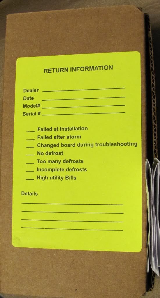 My guy has a little control board sitting in a box on his work bench. Not an unusual thing; on the equipment he works on these boards are pretty common now. When one burns up or fails, he has to swap them out. It must be under warranty, too, because the board's box has a big yellow Return Information label on the top.